Tuesday 10 November 2015

Castle saga continues...

The farcical story of the farmer who built his own house over several years without planning permission, in secret, hidden behind a huge stack of hay bales, is evidence, if any were needed, that architectural flair and the most basic command of propositional logic need not go hand in hand.  I visited the site earlier this year to see for myself; as I reported in my earlier post on the subject, I was stunned by how cleverly designed and beautifully crafted the building itself was despite it being largely constructed out of reclaimed materials (including grain silos for the two 'turrets').  It's pastiche, sure, but it's really, really good pastiche: lovely and sweet without being twee, witty and surprising whilst remaining somehow rather elegant and understated.  I was equally stunned, though, by how foolish the owner, Robert Fiddler, had been in his attempts to circumvent the planning process, and in his apparent refusal to accept the inevitable, namely that the building will have to be demolished in line with a court order to that effect.

Mr Fiddler, having (predictably enough) ignored the demolition order, has now been held in contempt of court. He has been told that he will be jailed if he does not comply with the order by 6 June next year.  Sadly, from the BBC report, he has, it seems, right up to the last moment still been playing silly, hopelessly ineffectual games vainly aimed at keeping the building standing: "Mr Fidler has told Mr Justice Dove that he had sold the house at Honeycrock Farm in Salfords to an Indian businessman and that the injunction ordering demolition was invalid."  What did he think the Judge would make of that? That the law would say 'oh well, Mr Fiddler, since you've sold the property, you are completely off the hook'? Honestly!

It is all rather tragic.  If only Mr Fiddler had possessed the slightest understanding of how to work with the grain of bureaucratic authority he would be able to enjoy the fruits of his considerable constructional achievements.  Honeycrock Castle could easily have been showcased on Channel 4's George Clarke's Amazing Spaces or, perhaps, Grand Designs - instead of on Damned Designs: Don't Demolish My Home.

You could, though, equally observe that if only volume developers such as Taylor Wimpey and Barratt Homes, who, unlike Mr Fiddler, are very good indeed at playing the planning system, had even a modicum of that man's talent and flair for design, suburban Britain would not look anywhere near as awful as it does.   Again, legalistic book-smarts and design ability are two very different things, and we live in a world where if you want to build anything you need a lot of former and absolutely none of the later.  

Friday 16 October 2015

And the winner is...

Last night, the winner of the RIBA Stirling Prize 2015 was announced: Burntwood School in Earlsfield, South London by Allford Hall Monaghan Morris.  


For a contrasting, more positive assessment, though, take a look at Oliver Wainwright's write-up in Guardian

Wainwright makes a persuasive-sounding case for the building, but I stand by my criticisms. People are drooling over the angled concrete pre-cast panels, but only because this 50s/60s retro style is currently bang on trend: indeed, half the other buildings on the shortlist have a similar sort of finish.  The panels are unlikely to provide much lasting visual interest, although, in fairness, the Guardian article does talk about "... the changing light playing across the buildings’ hefty sculpted surfaces" inspiring students' artist endeavours.  Hmm, mayyy-be. But if, instead, the real gravamen of the appeal is (consciously or unconsciously), as I suggest, the present modishness of the retro concrete style, then that really tells against the decision.  It takes a particularly moronic type of philistinism to treat astuteness to trend as the highest possible virtue in art.   Particularly a type of art (architecture) whose physical presence has an unfortunate habit of sticking around for much longer than the trend in question.  But there we. It is the RIBA we are dealing with here, after all.

Maybe it all gets a lot better inside: I didn't get to see the interior when I swung by.  But the pictures do not look that all that compelling.  Indeed, all Wainwright really has to say about the inside is that the classrooms "... enjoy high ceilings and big windows".  Well, the high ceilings are surely a product of the awesomely handsome £41 million budget and the capacious nature of the school's suburban grounds rather than any special genius on the part of the design team.  And the big windows might have something to do with the fact that the extensive grounds means that the main new building is lucky enough not to be immediately overlooked / overlooking other properties: again, not a triumph to the lay at the feet of the architects.  

Contrast the generous parameters of the brief for Burntwood School with that of, say, Clapham Manor Primary School, which was nominated for the Stirling Prize in 2010 but didn't win.  Clapham Manor, which I visited during last year's Open House London, involved a much more challenging brief: the size of the site for the new extension was not much more than a postage stamp.  Yet it converted this into a far, far better-designed building.  That school presents an inciting, welcoming front to the street, with interior packed full of ingenious features, such as easy to open, letter-box-shape windows which somehow give the classrooms, as the review linked above points out, the sensation of nesting in the trees. 

Burntwood, instead, goes in for dull, po-faced seriousness.  Indeed, one of the stated ambitions of the design was to ape the feel of a university campus in the hope that the supposedly more 'grown-up'-virtues of tertiary education will rub off on the pupils by association - a painfully crass gambit for the reasons mentioned in my earlier post. 

What the Burntwood design had going for it was, crudely, a very, very generous budget, as mentioned earlier. And that really is the main point of the RIBA's decision, it seems. For this was one of the last schools to be built under the last Labour government's Building Schools for the Future initiative, which was cancelled under Michael Gove's tenure as Secretary of State for Education.  As Wainwright himself says, the decision to award the Prize to this project "... sends out an important message about the importance of investing in the design of schools". Hear, hear: but is the RIBA really the best, the most-disinterested stakeholder to be delivering that message?  

You see, I'm by inclination a supporter of the Building Schools for the Future programme that the Coalition government scrapped.  Gove's accusation that architects were "creaming off cash" under the scheme sounded, frankly, hysterical.  If this was something that was ever happening, the Government ought to have been able to prevent it through being a canny client and drafting better appointment terms and generally keeping better tabs over procurement processes.  Yet if the RIBA wanted to itself lend substance to suspicions that the programme (or any hoped-for replacement) is viewed by architects as a gravy train, using the Stirling Prize to make a political statement by handing out the award to the mediocre, but very costly Burntwood School is a great way to go about it.  


Sunday 11 October 2015

Peckham's ugly progeny

Previously, I wrote about Will Alsop's Peckham Library, which I saw as part of this year's London Open House (item '6.' in the post).  I said that I suspected it must have been an influential work, because the building seemed to embody the defining characteristics of a whole era of British architecture (circa 2000-2010) and it dates from early on in that period (2000) and won the Stirling Prize - ie, it would, therefore, have certainly come to the attention of all of the architects of that generation.  The example set by Alsop wasn't a particularly edifying one: as innovative as the Library may have been, it set a dismal trend for half-arsed gestures towards 'friendliness' (outbreaks of curvilinearity, brightly coloured panels and a general lack of gravitas) and a commitment to the sort of fun-less 'fun', in the form of tiresomely wacky spatial organisation and funny-shaped roofs, that, wrapped up in appropriate jargonese about 'place-making' and 'aspiration', one can all too easily imagine receiving a hearty bureaucratic seal of approval.

At any rate, I can't resist posting about something I saw whilst out cycling this weekend which seems to ape the stylings of Peckham Library more literally than I would have imagined anyone would dare, let alone care, to.  Note the light-green (presumably, as with the Library, patinated copper) cladding to pick out a rectilinear board of a first floor facade, the use of pilotis to mark out a forecourt at the front, and a supposedly mischievous element of non-orthogonality in the roof-line.  The building in question is an extension to primary school, St Polycarp's, in Farnham, which, apparently, was designed by an outfit called Re-format and completed in 2012 at a cost of £1 million.  Since only a short while later (in the last couple of years), perhaps in small part due to the devastating criticisms of the likes of Owen Hatherley from 2010 onwards, the whole design philosophy fell dramatically out of favour, this very recent building manages already to look very dated.  As well as shit.  

St Polycarp's RC Primary School, Farnham (2012)

Peckham Library (2012)


Friday 2 October 2015

Open House London 2015 - Review, Part 2

Continuation of my review of what Southwark LB had to offer in this year's Open House event (see here for Part 1) :-

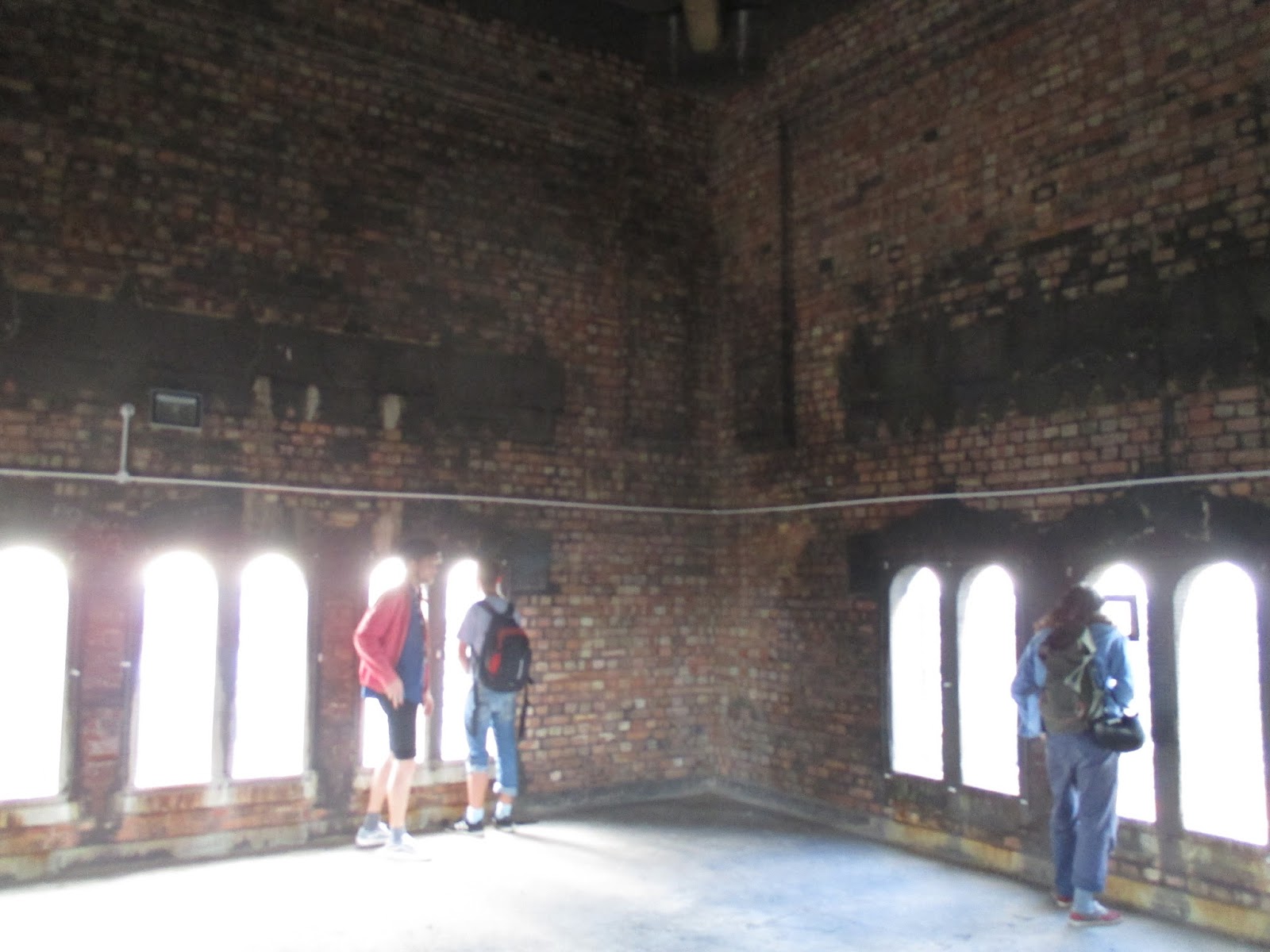
6.  William Booth College, SE5

Just over the road from Denmark Hill station, this seriously imposing, deliberately barrack-like set of buildings, designed by Sir Giles Gilbert Scott (Battersea Power Station and the classic red telephone box), serves as the Salvation Army's training school for 'officers' (ie the denomination's version of ministers or clergymen) .  It is not, by some way, the most attractive of Scott's work.  Its tower though - according to the officer who gave us the tour, slightly higher than the dome of St Pauls - offers a great panorama of London and a good vantage point to survey the new face of the City, Shard, Walkie Talkie and all.


7.  ORTUS, Camberwell

This 2013 building by Duggan Morris Architects is bang on trend.  With a vaguely Arne Jacobsen (St Catherine's College, Oxford) feel, it's all tasteful, nicely finished rectilinearity in exposed concrete, brick and glass.  It is, therefore, desperately boring.  

What does the building do, anyway?  Not entirely sure:  it is apparently a "pavilion housing learning and events facilities, cafe and exhibition spaces" according to the Open House guide. The promotional material attempts to elaborate with babble about providing a "totally immersive learning environment" via "interconnecting spaces to encourage intuitive learning activities".  Hmm.  Here's an idea.  How about, folks, when you are writing this sort of thing you try saying something like "Local schools book out rooms in our building to put on lectures or rehearse plays." (if that is indeed the deal - who knows)? Or would that make it all too obvious?  All in all, I didn't find this to be a terribly enlightening or inspiring visit.


8.  Eco-home, Carmarthen Place, SE1

This house, tucked away in a quiet courtyard, was assembled in a matter of days from prefabricated wooden sections, bolted together.  This ought to translate, one would imagine, into an appealingly techtile (my word for 'technologically intelligible', ie that winning sense of 'ooh-you-can-see-how-that-was-put-together') appearance, but somehow neither the interior nor the exterior really draw one's attention to the construction process.  This is despite the minimalist finish: all of the interior walls are just the bare spruce of the prefabricated cassettes and the exterior finish is plain wood as well.  The problem is that if you didn't know about the build method, you would assume that all the wood was mere cladding behind a standard concrete and steel frame or breeze block construction.  

Inevitably the finish, particularly in the interior, is to a high standard, but it's all a little dull frankly.  Here's a big plain wall of spruce; here is another big plain wall of spruce; and here's another big plain wall of spruce, but, look, it's curved this time.  It has much less of the resourceful charm of the other domestic build, Asylum Road, that I saw earlier in the weekend (see Part 1). It's not that Asylum Road is less minimalist in style, or any more filled with stuff: both places are composed of undecorated planes of material.  But Asylum Road's blank planes are so much more engaging because the tighter space-requirements and the architects' sensitive responses to those requirements, mean that the particularities of each pane of glass, each metal frame - their position, their dimensions - appear highly intelligible. There, everything is just right.  Here, all the dimensions - of this or that wall, or banister, or window - whilst unimpeachably sensible, also appear, in their particularities, more or less arbitrary: nothing in their geometry asserts itself as having had to be designed that way.  It's the aesthetic equivalent of the difference between a poised, tender touch and an indifferent shrug


 9. Brunel Museum (Thames Tunnel Shaft), Rotherhithe

The Thames Tunnel, between Rotherhithe on the south side, and Wapping, on the north, of the river, was the first tunnel ever to be constructed beneath a river.  Built by Marc Brunel, assisted by his now more famous son, Isambard Kingdom Brunel, its construction took 18 gruelling years between 1825 and 1843, nearly killing Isambard (and actually killing a number of workers) in one of several catastrophic floods.  Why was it so difficult?  Because the Brunels were basically tunnelling through sand and wet clay: very much like trying to dig a hole in the wet sand on the beach where it meets the sea.  Worse in fact, because they were tunnelling all too near to the bottom of the Thames, hence the frequent flooding. Worse, moreover, because the Thames in those days was a huge foul sewer and hence completely toxic - several of the men working on the tunnel went blind from the 'river gas' vapours alone.  Although the tunnel helped cement the reputations of the Brunels, was hailed as the Eighth Wonder of the World upon its completion and the techniques used in its construction paved the way for all subsequent successful soft-soil tunnelling operations (a mainstay of the London Underground network), somewhat tragically (given all the effort, expense and loss of life and limb) it was never profitable - largely because the finance necessary to enlarge the entrances to allow horse and carriage traffic to enter never materialised. 

So soggy and insubstantial was the material that they were conjuring with that in order to create the shaft at Rotherhithe, rather than digging downwards, Marc Brunel built an enormous brick and steel drum (much like a gasometer) which was allowed to simply sink under its own weight, at a rate of a few inches a day, into the mud.  This shaft was, for Open House, open to the public.  One could descend about two thirds (I believe) of the original depth: the final third of the depth lies beneath a more recently installed floor, which covers the not-entirely-aptly named London 'Overground' tube line (formerly the East London Line and before that the East London Railway), the tube network having taken over the Thames Tunnel in 1865 making it the oldest piece of infrastructure in the London Underground system.  It's a cold and eerie space, rumbling with echoes of the tube trains below.  The place and the story behind it serves as a reminder of the majesty but also something of the terror of great 19th century engineering projects.  


10. The Old Mortuary, Rotherhithe

Round the corner from the Brunel Museum is a community centre located in a late C19th mortuary.  According to the lady giving the tour, Rotherhithe needed a mortuary because it was a major receiving point for corpses found washed up beside The Thames at that time, thanks in part to its policy of rewarding those who retrieved bodies from the river with the payment of a crown a corpse (Wapping paid only half a crown).  

The building has been modified a fair bit since, but there were at least a few grim details to see, such as a big iron bar crossing the ceiling of one of the rooms used to hang bloated bodies up to drip-dry - or the fact that the community centre's kitchen was formerly a room into which putative kin of the deceased were led to identify the corpse, which they did through a opening giving onto the next room where the corpses were laid out (now the main events hall). It was somehow gratifying to stand in the latter room and be served tea through the same opening.  


11. Sands Films, Rotherhithe

I almost didn't bother seeing  this one as the write-up in the guide didn't appear all that thrilling ("Grade II listed riparian granary built with reclaimed timbers felled in 1700s. Converted in 1970s to picture library, film studios, prop and costume workshops ... "), plus the day was coming to an end and I assumed that the place would be closing soon. However, it turned out to be the most magical of all the places I visited during the weekend. 

I hadn't heard of Sands Films before, but it transpires that they are thriving production company.  They make sets, rent out studio space, but are above all known for making costumes for period dramas, eg the 2005 Pride and Prejudice, The Young Victoria and Wolf Hall.  

The tour we were given was a fairly epic affair, incorporating a proper, 20 minute sit down lecture in the on-site cinema by Olivier Stockman, the company's Managing Director followed by talks by three other members of staff, at different locations around the complex. These included a seemingly impromtu mini-tour by Christine Edzard, a co-founder of the venture and an Oscar-nominated director in her own right.  The best of the four speakers, in fact, was the last, the head of the costume department.  Despite clothes being something I have zero interest in, she had me and the rest audience absolutely spell-bound (funny how you can sense this through the polite silence long before the applause) with a spiel that beautifully explained various aspects of the process of designing and putting together a costume, somehow managed to make telling points about the socio-political implications of the subtleties of Victorian dress conventions, whilst weaving in lovely nuggets about the wider film production (such as the fact that these days casting decisions are often made last minute - causing predictable headache to the costume-makers).  She also managed to take our half-baked questions and spin out insightful, witty, richly (but wisely) opinionated answers. Although it was getting quite late, and many people there hadn't, I would guess, counted on the tour lasting as long as it did, she received the closest thing you can get to a standing ovation from people already standing.    

The interior itself was rather delightful as well  One imagines a studio as a featureless, strip-lighted hanger but Sands Films's premises is more like a Dickensian warren of low-ceiling rooms.  One room will be kitted out with comfy furniture, antique knick-knacks, books and memorabilia, the next filled with sewing machines, ribbons and jars of neatly-labelled buttons, pins and beads.  There seemed to be a whole floor of stored/used dresses, the racks delightfully by period (eg 1830s-40s).  Ironically, the haphazard warren-of-rooms layout isn't, it seems, an original feature: according to Stockman, the original Georgian warehouse building was simply a brick shell for goods to be piled up in, with no floor even, let alone subdividing walls or floors, indeed, something rather closer to the studio 'hangar' of popular imagination.  


For a long time Sands Films rented the rambling site, but soaring rents prompted them to fund-raise to buy the freehold in 2012.  Lucky they acted when they did, because property prices in London have sky-rocketed since then, presumably meaning that they would otherwise have been forced to move to some anonymous building out in the suburbs by now.  

Wednesday 30 September 2015

Open House London 2015 - Review, Part 1

For this year's Open House London, I decided to take on the London Borough of Southwark. This strip of the capital stretches from a slice of the south bank of the Thames centred around London Bridge straight down to Peckham/Dulwich in the heart of South London. It takes in quite a few big-name sights, particularly around the Thames, including the The Globe, London City Hall and The Shard.  

I focused instead, though, on some of the less well-known locations listed in the guide, visiting 11 of them by the end of the weekend (get that you people who won the ballot to see 10 Downing St or the BT Tower and didn't bother to see anything else!  Not that it's a competition...).  Indeed, so ruthless was I in my quest for efficiency that I walked straight past a couple of places on my list because the queues were too long, resisting the temptation to flash the "L" loser sign at the all-too-patient punters as I walked by.  Anyway... here's a run-down of what I did see.  

0.  A pre-Open House stroll wall around Southwark proper

This part of London, on the other side of the river from the City, is changing all the time these days - with the addition of City Hall a few years back, then The Shard and, recently, the neo-Bankside development visited in a previous post.  What public space remains is filled, it seems, with people doing nothing but taking photographs of the latest architecture (The Shard, in particular), so for 10 minutes or so, before the first building tour started, I thought I would briefly join their ranks.


1. Unicorn Theatre, Tooley Street

Britain's only dedicated children's theatre, which opened in 2005.  The exterior building is a dull box but inside there is lots going on from a design point of view.  A member of the design team giving a tour of the place outlined the challenges of, amongst other things, accommodating fly lofts for the theatre scenery, deciding whether or not to have ticketed seating and the knock-on effects on the interior layout of this, and housing the theatre rabbit on the roof. 


 2. Tower Bridge Magistrates Court, Tooley Street

Just up the road from the Unicorn was another, strange addition to the Open House roster: a disused Magistrates Court, bought up by developers with an as-yet unrealised ambition to turn it into hotel.   The developers signed up to Open House, it would seem, to try to drum up support for the scheme.  They were, rather hopefully, handing out postcards to people so they could make representations in the developer's favour to the local council, the claim being that the plans would be better from a conservation perspective than the likely alternative, namely total redevelopment of the site to make way for residential flats, because the hotel concept would at least retain (some of) the original fittings and fixtures. There are plans, in particular, to turn the main courtroom into a restaurant hall, with the benches serving as dining booths.   

The real appeal here was in marvelling at the bizarre, Marie Celeste way in which the place had been left, apparently in something of a hurry, by the previous occupants: virtually all the fittings in place, down to the coat of arms hanging on the wall the courtroom and the final rota displaying the names of the police custody team on a whiteboard outside the grim holding cells (which sadly there are no plans to retain).  


 3. The Coal Line, Peckham

This event involved a piece of infrastructure that has, yet, no physical presence, not even a construction site.  The Coal Line is a nascent project to create a linear park, just under 1km long, alongside the railway line between Peckham Rye and Queens Road Peckham.  We were taken on a tour of the proposed route of the park by the local volunteer group who are trying to push the scheme through. Or, at least, we walked alongside it, as much of the park is intended to be carried by a railway viaduct traversing abandoned Edwardian coal-delivery sidings, presently off-limits to the public.

I'm, for one, sold on the idea: I think it's great.  In a previous post, I excoriated another proposed linear park - the godawful Garden Bridge across the Thames.  The Peckham project is absolutely everything that The Garden Bridge (TGB) is not.  It involves the reclamation of open space not current accessible to the public as opposed to, as with TGB, the private enclosure of something (ie The Thames) which is already public space; it makes maximum use of existing physical infrastructure as opposed to requiring, as does TGB, a vast and needless lump of engineering to be constructed from scratch at great financial and environmental cost; it will actually function as a genuine public territory - a normal park that you can fucking well walk straight into, for God's sake - rather than, as with TGB, a space where ordinary people are made to feel that they are, at best, being tolerated 'on sufferance' due to the ticket barriers, bouncers and random closures for corporate events; it also brings much needed recreational space to a very densely populated area that doesn't have much of the commodity as opposed to creating, as the TGB, a park that is no-where near anyone actually lives and so by definition can only function as a tourist attraction.  And whereas TGB is a vanity project of Joanna Lumley heading up a cabal of powerful, well-connected big-wigs (this comment is not mere conspiracy theory), Peckham's Coal Line is about as grassroots as you can get, driven as it is by a group of "committed local residents with big dreams and bright ideas", as the website puts it.


The current state of play is that the project organisers are seeking to crowd-fund a feasibility study, something which Network Rail, who own most of the land, have required to go forward with the project.  Even though I'm not a local resident, I've pitched in because this is exactly the way I think future development in this country should happen. I really hope it gets off the ground.  

5.  Private residence, Asylum Road

One of the ideas in the book I'm writing at the moment is the notion that the manoeuvres that people are forced to employ to overcome tricky, restrictive design briefs always tend to add intelligibility to a design, making it more interesting and inviting than it would otherwise be had the brief been less restrictive in the first place.  This principle certainly holds true with this tiny house, built on the footprint of a former garage.  It is completely delightful, and what makes it so are the clever devices that it deploys to maximise the use of space: sliding doors, cub-hole style bedrooms, tiny, sunlit courtyards, use of mixed-height ceilings to make living spaces seem far, far, more expansive than their really are.  There is more going on here than in many a home four or five times the size, but it magically didn't feel cramped - even though there were more than a dozen visitors wandering around inside. Inspiring stuff.


It could have been very different in fact: I asked the lady who, together with her husband designed and built the place, why it was so much less high than the terrace houses that it abutted.  She explained that they had bought the site with planning consent in place, and simply redesigned the house within the existing envelope of the permission that had been granted.  They could have sought to extend it, she admitted, and indeed there was a chance that this would have been granted.  But I don't think they should be regretful about this decision at all: again, arguably, its the very limited envelope in which they were operating which brought the best out of the designers and makes the house what it is.  

6. Peckham Library, Peckham Hill St

Will Alsop's Peckham Library, winner of the Stirling Prize in 2000, is, it dawned on me walking around it, a heck of an influential building.  It basically defines an entire era of British architecture, namely that of the Blair/Brown years (1997-2010), or, more particularly, of the design quango, CABE (Commission for Architecture and the Built Environment, 1999-2011) that they set up and whose recommendations helped promulgate the style-book of the epoch. What does the style involve?  A kind of cheery, irritating vacuousness, basically: bright colours, supposedly 'friendly' curves, wacky spatial organisation and a post-modern obsession with creating 'iconic' forms (read: memorably weird, unique shapes). The classic text (already) is Owen Hatherley's A Guide to the New Ruins of Great Britain (2010), which chronicles how increasingly dismal architecture of this type mushroomed up all over the island over this period.  (The style has, incidentally, now entirely fallen entirely out of fashion: virtually all new developments seem to be exercises in tasteful, grey, largely rectilinear minimalism  - see the entrants for this years Stirling Prize for a flavour).  

I kept thinking, as we toured the interior by a member of the library staff, of Hatherley's book even though it doesn't cover this particular building.  All the basic elements he identifies are here.  The basic design is wilfully counter-intuitive: a giant up-side down 'L' that suspends the main library area above an enormous forecourt.  The building is clad on one side with a material (patinated copper) that proudly announces 'design quality' on the other with brightly coloured panels.  Best of all, the wonderfully crass concept of the "pod" pervades everything.  The pods are strangely shaped enclosures suspended like enormous fruit within the envelope of the building (and in one case poking out of it, to create a typically CABE-) designed to create segregated, quiet spaces within the interior: a comically over-engineered solution to a problem already solved several millenia ago with the invention of the "room". 


It can be argued, nonetheless, as the librarian taking us around did, that, in the context of this particular building, all this silliness was for a good cause: our guide pointed out, approvingly, that the non-intimidating look of the place was intended to be welcoming to kids from what is a fairly deprived area who might be put off attending a library with a more forbidding, institutional feel.  I can believe this: the very young children in particular seem totally relaxed in the place - wandering in and out of the rooms/pods, chatting (quietly and sweetly) to the library staff and members of our tour group.  And it's not a bad building, overall.  Even the pods are, if somewhat useless, well-made and quite attractive as decorative features.  But like so many pioneering buildings, it set a terrible precedent. The desire for a childish 'non-intimidating look' has no sensible application to a residential block of flats - the very idea comes across as insultingly patronising in such a context - and yet, following the feted example of Peckham Library, every developer in the noughties stuck a "wavy roof" (per Hatherley) ontop of each of their jerry-built tower and a random coloured panels on the outside walls.  Alsop, therefore, has a lot to answer for in my opinion.


... To read part 2, click here.