Thursday, 30 April 2015

Logos, Italian style

As corporate logos go, I really like that of ENI (the Italian oil giant):


There is a surreal, children's book-illustration feel to the silhouetted creature (a dog, apparently). Magically, it has 6 legs and it is merrily breathing fire.  The legs have a jagged, cut-out quality to them. The tail, bizarrely, is shaped like the baroque curve of a violin's sound hole. The creature's backward-looking face, meanwhile, bears an expression of innocent joy.  

This is a mascot with real charm and personality: not qualities that one usually associates with a faceless multinational. The effect is halfway between a Le Chat Noir poster and a Oliver Postgate / Peter Firmin creation.

Below the dog, the lower-case 'moderne'-style lettering, ever so slightly cropped at the bottom, is very stylish. The field of yellow behind it is cool too, yellow, again, being an unusual choice in the world of corporate iconography.  

I noticed how awesome this logo is whilst staring at some documents at work.  I subsequently googled the matter to see if there is anything interesting to discover about its origin.  There is: ENI's own website dedicates 4 whole pages to the history of the design.  

These pages are wonderful to read. I particularly like the "official explanation" (a strangely agnostic phrase in the context of this being ENI's own website) of the look of the creature. Apparently "..the six legs of the imaginary animal" represent "...the sum of an automobile's four wheels and the driver's two legs", this being "... almost an assurance that this means of locomotion becomes the fastest possible through the symbiosis between automobile and driver".  Well, of course: I'm assured!

I also like this nice cross-cultural titbit:

"An interesting parallel can be made out also in African mythology in which animals with more than the normal number of legs appear precisely to signify uncommon strength. In Tanzania and Kenya you can sometimes see lions and leopards with six legs among the carved wooden statuettes of Makonde art. In Nigeria, too, in the Benin bronzes, there are examples of animals represented with more than the ordinary number of legs, giving the idea of supernatural power.""

I bet that's something you didn't know when you woke up this morning. This is an oil company that clearly wants to be the new Stephen Fry.

What is said about the history of the logo's birth is instructive. The design wasn't arrived at as a result of the firm hiring a corporate branding consultant. No, in 1952, ENI ran a national competition "open to all Italians", with cash prizes, which attracted over 4,000 entries. The competition was judged not by company's own board, nor, again, by branding consultants with a brief to ensure that bland corporate values were to prevail, but by a jury consisting of an artist, an architect, a literary critic, a satirist, and a journalist / "biographer of various popes". This amazingly bohemian-sounding group took 14 sessions to unanimously select the winning design, according to the website. A complicated tale is then told as to how the real designer of the logo, the sculptor Luigi Broggini, was only later revealed, Broggini having asked a fellow designer to submit his entry without his being attributed, for reasons that aren't made clear.

At any rate, from this story we can see why ENI has ended up with such a beautiful logo. 

The corporate culture that commissioned it was one that was serious, genuinely and profoundly serious, about art. Not in the sense of using spare cash to sponsor institutions and buy some social respectability in the process. No, serious about art in the sense of publicly entrusting the look of one's trademark - the visual essence of the corporate brand - to an open competition judged by a panel of artists and writers about arts. And going along with the result, even though it was a bit mad.

That was 1950's Italy.  Not all times and places have the same values. Can you imagine late 20th century corporate America doing the same thing? Can you imagine, say, ExxonMobil - ENI's US counterpart - agreeing to put a 6-legged dog on its logo?  

"Gee, why has this dog got 6 legs...?"

"I think our customers will be confused by this...."

"I don't think this projects the right level of seriousness for our business...."

"The fire coming from his mouth will remind people that oil is dangerous - I don't like it!"

So they end up, instead, with this crushingly soulless design:


You may say I'm making a fuss about not all that much.  I don't think so.  

For the workers of any organisation - that is to say, for most of us - that organisation's logo is something you see every single day of your working week. It's there on the back of every van you unload, or on the letterhead of every piece of paper crammed into piles on your desk; quite possibly you have to wear a uniform emblazoned with it. In a pretty tangible way, it is part of your daily mental furniture: your mental landscape even.  

In those circumstances, it doesn't seem much to ask that the said bit of intrusive mental real estate has been designed with a bit of wit, a bit of flair and a bit of humanity.

Logos matter for reasons that go beyond considerations of corporate branding.

What's your favourite one?

Sunday, 26 April 2015

On the trail of Williams-Ellis; Mary Watts's cottages

Yesterday, to burnish my credentials as a proper Clough Williams-Ellis fan, I'd thought I'd try to track down a local work by him.  I was only half-successful.  I actually found the place I was after, but I didn't manage to established whether or not it was by him.  That's a bit odd in this day and age. You'd think you'd be able to conclusively determine with some simple internet searching whether something less than a century old was, or was not, done by a very famous architect who only died less than 40 years ago, but no.  The story is an illustration of how a simple point can take an inordinate amount to research...

Part of the problem seems to be that Williams-Ellis's own records were destroyed when his ancestral home, Plas Brondanw, burned down in 1951. For this reason, the helpful Wikipedia page that lists his works states that it is based, instead, on the list of drawings held in the RIBA Drawings Collection. There are a quite few entries for Surrey on the list, but a lot of these are for minor works (unspecified "additions"; "banister details" etc), and so possibly not, even with all the enthusiasm that a fanboy can muster, actually worth hiking over to see.

One of the more substantial-sounding entries was "Design for a pair of cottages for Mrs. Watts, plan & elevations, 1912" in the village of Compton. Compton is only about 4 miles away from where I live, so this seemed like a good place to start.  Also, whilst it isn't clear from the Wikipedia list whether any given entry represents an actual completed building, as opposed to an unbuilt design, the appendix of commissions that appears at the back of Williams-Ellis's 1971 autobiography (which claims to omit designs not "actually ... realised") mentions a "Cottage group (Compton)".  This reference to a "... group" doesn't sound like quite the same thing as the RIBA's record of a "... pair", but, nonetheless, this was reasonably promising.

Some more googling, and I established that the Compton cottages were a listed, semi-detached pair forming part of a group called "Oak Cottages", and that they had been commissioned by the painter and Arts & Crafts impresario Mary Watts.  Watts had created the nearby, excellent Watts Gallery, so this all seemed quite interesting.   Mysteriously though, the English Heritage listing text states that the pair of cottage were merely "[r]eputedly designed by" Williams-Ellis. So at the time of the listing, 1996, at least, English Heritage had no idea.  

Was I going to be able to do any better?

I put the address into my phone, and set off on my bicycle.   After a hard climb up the Hog's Back, and a quick descent into the village, before long I had found Oak Cottages.  Nos. 1-4 ("probably designed by Sir Ernest George", according to the listing text) are cute, largely thanks to their front gardens and the wisteria trained on their walls:


Some uber-Arts & Crafts-y features are in evidence, such as the panes of the leaded windows being out of line with each other to a comical degree (quite visible even in the zoomed-out photo above) and mannerist touches such as a blind-arcade on the chimney, of all places:


Nos. 5-6 (ie. Williams-Ellis's ones, "... reputedly") are maybe less immediately cute, but are certainly handsome, and make more of a statement with their plunging roof-lines and unusually large gabled wings:


Taking photos of the cottages without trespassing or being seen apparently pointing a camera into someone's living room was a bit of a challenge.  Whilst I was taking a picture, a wise-looking lady, possibly in her late '60s, carrying a potted plant emerged from one of the neighbouring properties (not one of the cottages).  She saw me standing awkwardly with my camera and asked in a friendly manner: was I researching the Arts & Crafts movement?  I said that I was, or, at least, I was writing an architecture blog. She then told me what she knew about the cottages.

Her understanding was that the terrace of 4 were the oldest, with the semi-detached pair having been built a bit later, in 1908 she thought (the English Heritage listing gives a different year, but, actually, her date makes more sense if this was a Williams-Ellis design, since in the year the listing text gives, 1895, Williams-Ellis would have been only 12 years' old). Mary Watts had built the cottages for her workers, who built the Cemetery Chapel (see below) amongst other things. The grander, semi-detached pair were, she believed, for the senior craftsmen.  The workers included potters at her nearby kiln, who provided the terracotta for the chapel.  Apparently, rather than hiring in skilled workers, Mrs Watts trained up locals for the work, a fact that indicates the level of commitment that she had to her Arts & Crafts 'guild', as, of course, does the fact of her providing the workers with lovingly designed homes.  She mentioned that her late father had lived in one of the cottages - something I would liked to have asked more about had there been time.

The lady next-door was about to head back inside with her pot before I asked: did she happen to kno
w if Clough Williams-Ellis had designed any of the cottages?  Surprisingly, she did have some more information on this question.  She explained that she had read a Country Life magazine article, about 25 or 30 years ago, which had said that the experts had decided that the cottages were probably not designed by Williams-Ellis after all.  The plot thickens...

Later, when I got back home, I tried to google the relevant Country Life article, but had no luck. It would be, anyway, a bit odd if something to that effect had come out, say, 25 years ago, as the lady indicated, because that would pre-date the English Heritage listing suggesting that it was thought that Williams-Ellis probably had designed it.   It then occurred to me that if I really wanted to find out the answer to the question, the thing to do would be to look at the original drawings held by in the RIBA collection and compare these to my photos of the cottages, since a lack of correspondence would pretty much rule out the Williams-Ellis connection. But this would, it transpired, on further investigation, mean pre-booking a visit to the RIBA study room at the V&A museum (where the drawings are apparently kept), and potentially all sorts of faff at actually getting hold of the drawings out of whatever archiving system they operate.  Maybe on another day; maybe not...

Meanwhile, I decided to pay a quick return visit to the Watts Gallery and the Cemetery Chapel to remind myself of the handiwork of the potters associated with the cottages.  Here is the extraordinary brick and terracotta Chapel:


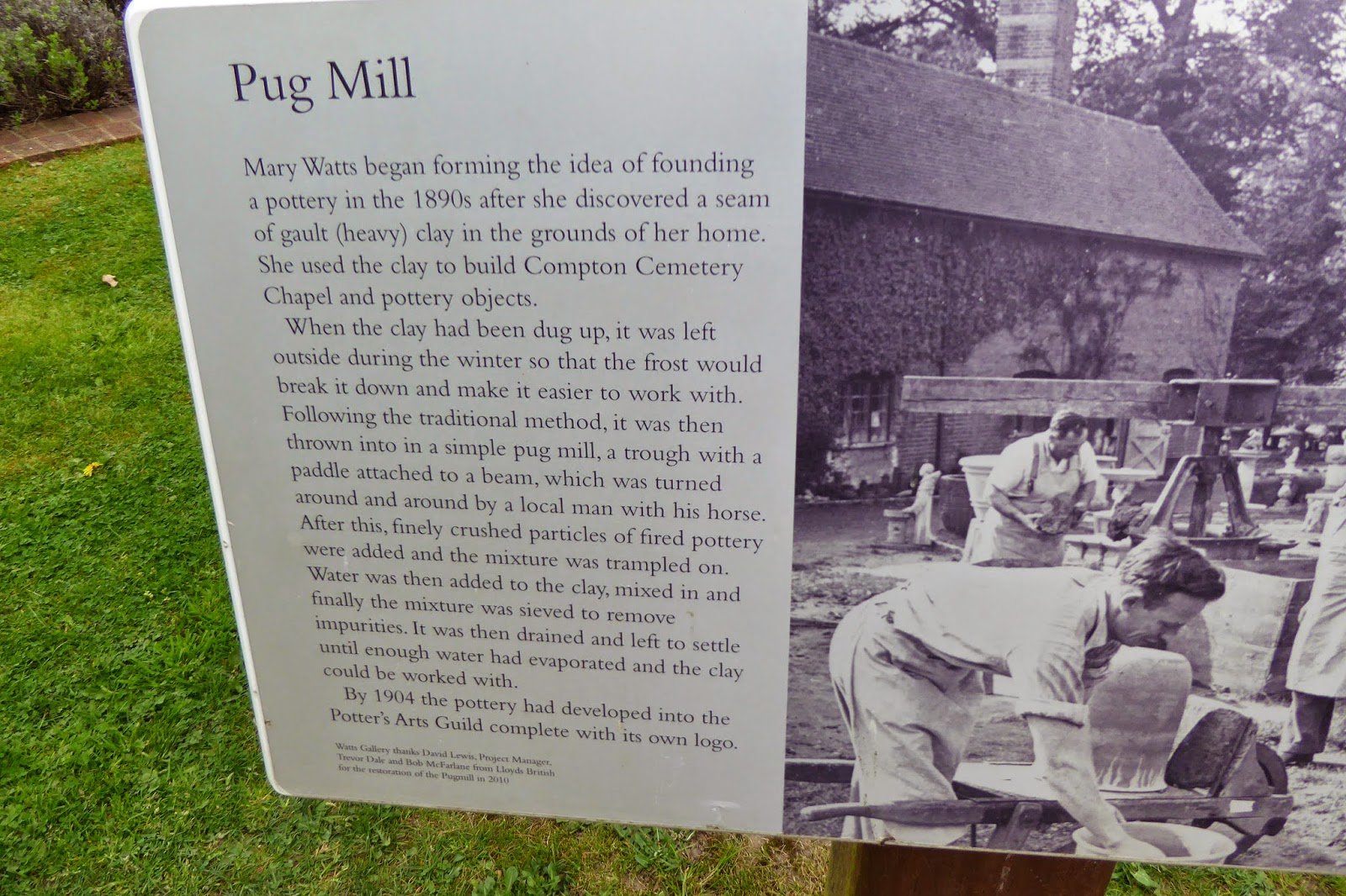
And this, in the grounds of the Gallery, is the area around Mary's kiln, where there is restored "Pug Mill", the device used by her team to grind the raw clay:


The Pug Mill is also mentioned in tiled plaque on the wall of one of the buildings, commemorating David Real, a "POTTER AT THE COMPTON POTTERY".  This sort of thing epitomises the worker-elevating ethic of the Arts & Crafts movement. I love the somewhat awkward prose of the inscription, obviously Mr Real's own words:


Perhaps this guy was an inhabitant of one of the cottages?  At any rate, this was a nice, tangible bit of history that made the outing worthwhile.  

Wednesday, 22 April 2015

Unfinished beauty

We all know that buildings, like people and animals, have life-cycles. We know they are conceived (designed), grow-up (get built) and live (stand and serve their function). We know too that they may eventually deteriorate and even depart of this world.

Mostly, the building works are, in relative terms, only a small fraction of the overall lifespan. Rarely, this isn't the case, as with the unusual example of the never-ending construction of Sagrada Familia in Barcelona, some 130-years old but still far from completion, or where, as indeed with Honeycrook Castle, described in my earlier post, the completed structure is sadly destined to have a mayfly-like existence. But, generally-speaking, we expect the bulk of a building's life to be accounted for after it is finished.

Perhaps that helps explain why, when it comes to the business of appreciating buildings - liking or disliking, judging, being moved by them - we have a tendency to focus only on that middle bit of the life-cycle: adulthood, if you will. 

We judge the finished product. We don't judge a building on the chaos of its construction site any more than we judge it on the horror of the decaying piss-stained hulk (the pitiful state of which is likely, far from being invoked to condemn, to be held up as a rallying call for efforts at conservation). This seems only fair after all. The architect's intention is represented by that bit in the middle, not the mess created in achieving it, and certainly not the wrecking-ball at the end of the story. We are nice, fair people and we like to judge people on their intentions. So we politely suspend our appreciative faculties when it comes to the beginning and end of the construction cycle.

The occasional perversity of this blindness hits you when you notice a building under construction that actually looks fantastic:


As with a lot of steel-frame builds, this early part really is the best bit. A huge lattice-work of metal girders at play with the open sky. The angles and alignments combine and recombine into shifting configurations as you walk by (or perhaps I've seen too many of those Channel 4 idents). 

The very openness of the construction seems to represent limitless possibility: mankind can do anything it wants to, you can too. It is a powerful cradle that could enable any number of possible purposes. 'What would you do with this space?' it says. It's a monument to promise and potential.

If you think about, in this particular respect, steel-frame construction is unlike the other main contemporary building techniques. A reinforced concrete apartment block is usually at its most soul-destroying when it is just a concrete shell, as are housing developments when the breeze block core has been assembled but before the exterior masonry has been laid or the windows and other such fittings installed. At that stage, the bare, grey construct that meets the eye has all the enclosed, bounded qualities of a completed building with none of the comfort or humanity.

With a concrete building even if the design is mediocre at least things can only get better as the construction progresses. The opposite is more or less true for a mediocre design constructed with a steel frame. Which the above building is destined to be:


What a contrast the banality of the completed design (for Guildford's new Waitrose) makes to the thrill of the present unclad metal frame!  And this picture is of course from the developers' own promotional materials. This is the most flattering computerised image they could conjure up, complete with bright blue sky and impossibly verdant trees growing on the pavement right outside. It still looks rubbish. So what, right this moment, as I type, rises up against the sky as a monument to potential is destined to grow up to be a monument to mediocrity.


Anyway, this made me think. Are there any examples of projects where an unfinished structure has been widely recognised for the beautiful thing that it is?  

I can think of one: when The Shard went up, we all watched on with awe as the height of the structure shot up virtually daily. Particularly when the supporting structure was completed to, say, two-thirds of the way up the pyramid, with the glazing lagging maybe ten floors or so behind, there was a real poignancy in the effect. It was if the core of the thing was desperately thrusting up to its apex, with the half-unwrapped glass skin almost slipping off in the process. I'm not sure that the developers deliberately engineered the build process to create a spectacle, but good for them if they had – it was a good show.  

Sunday, 19 April 2015

The disappearing castle

The other day, I went to see a castle in the Surrey countryside, a few miles outside Redhill.

To reach it, I have to turn off a country lane and pick my way through a ramshackle industrial estate of converted aluminium farm sheds: body-spray shops, welders, window-fitters, that sort of thing.


And there it is: rising up incongruously in the back corner of the yard. A patch of gravel is swept up around it. The gravel apparently delineates the boundary between light industry and stately home. Outside the castle sits a yellow sports car, plus a couple of dogs. The flag on top is flying full mast, proudly indicating occupancy – defiantly, in fact, in the circumstances ...


The castle is a curious thing. The yard-facing side is a rustic manor house: a triple-gabled half-timbered upper story above a ground floor of honey-coloured brick upon a rusticated masonry base.

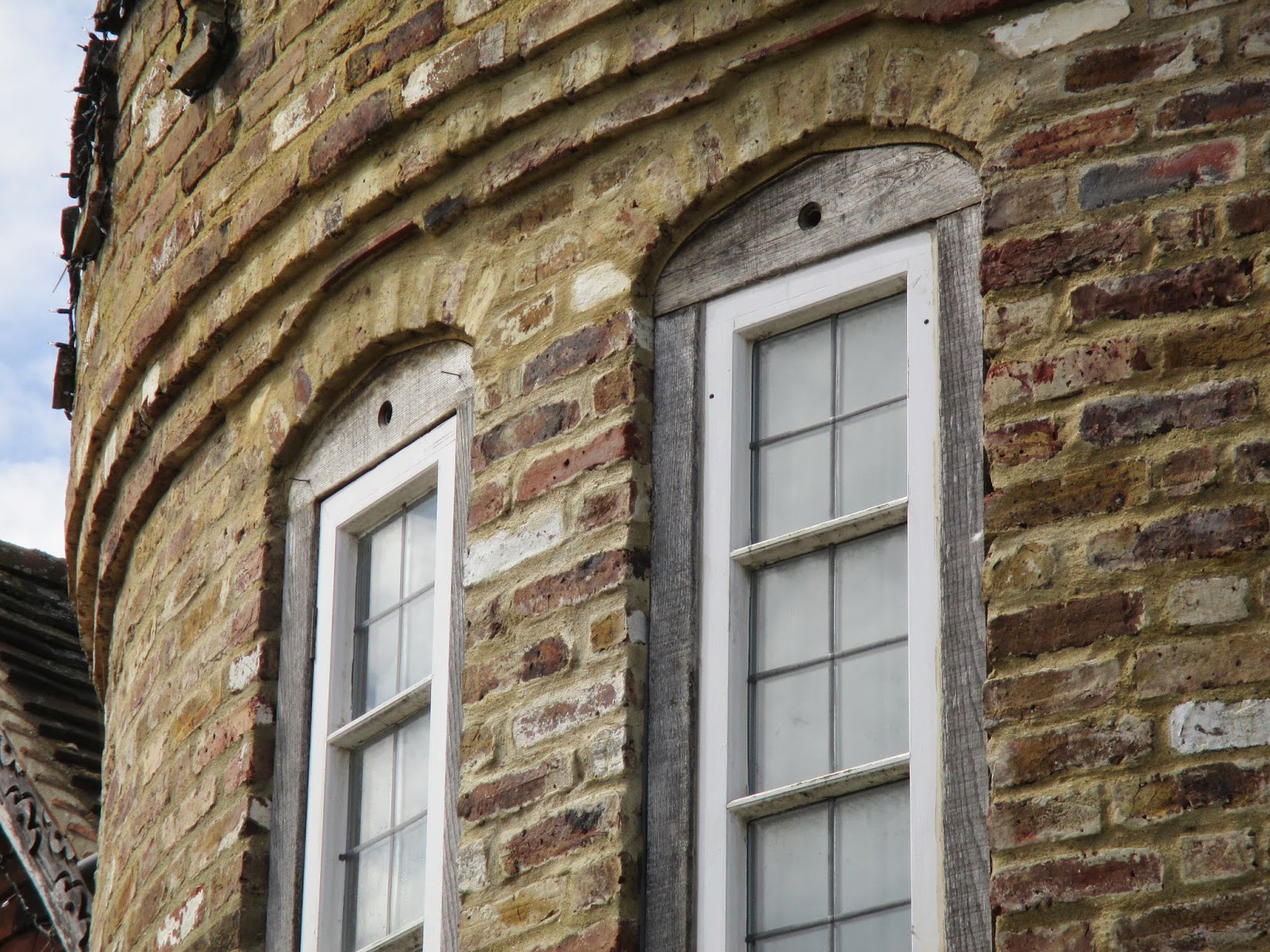
On nearer inspection, the thick oak timbers are well-joined, but very slightly wonky – pleasingly so, like hand-cut chips. A curvy pattern is carved into the bargeboard. The windows look like they might have been recovered as units from some place else.   In themselves they are nothing special, but they are cleverly made to meld into the facade by the simple expedient of their white-painted jambs being cased in strips of timber stained the same grey-ish colour as the rest of the woodwork. The bottom beams of the half-timbering to the right and left are supported by rows of cute wooden corbels. The bottom beam of the central section is without under-supports, apparently relying instead on the spiritual support of an inscription, carved in a cheery script: “WE THANK GOD FOR JESUS”.


The back of the building is rather different in its concept. The sides give a clue as to what that concept is.  Here you witness the end gable of the half-timbered frontage being arrested, half way down its slope, by an impressive two-storey, round tower complete with battlements. The join is nonchalant, as if being gobbled up by a defensive turret were the most natural thing to happen to an end gable.


Stroll around to the back, and the castle really reveals itself. The tower is matched with another on the other flank, and the pair dominate this aspect. The pedimented central section, between the towers, is nonetheless impressive, featuring a two-storey muntined and mullioned Tudor mansion-style window. The overall effect is like that of Penshurst Place crossed with a Henrican sea fort (say Deal or Walmer castle).


This place – Honeycrock Castle – isn't National Trust property. It isn't a listed building. It isn't mentioned in Pevsner's Buildings of England (hence my attempt at a Pevsneresque record above, for posterity....). Nor will it ever be. For one things, Pevsner only does extant structures, and by the time its Surrey volume is next updated, Honeycrock Castle will likely be long gone. In fact, it must be demolished within the next 90 days, on the order of Reigate and Banstead Borough Castle. Otherwise its owner could end up in prison.

The back-story, which I had read about in the national press, is crazier than the design itself. In short, it goes like this. The building was put up in 2002 by Robert Fidler, a farmer. Mr Fiddler kept the construction secret. Why? Because he hadn't obtained planning permission (apparently, he was in some sort of dispute with the council and surmised that there was no hope of getting consent – probably correctly, as this is Green Belt land). How did he keep it a secret? By shielding the emerging building with a curtain of 40-feet high stacks of hay bales and tarpaulin, that's how! (One doesn't like to link to the Mail Online, but their story does have a helpful picture.)  What's even more crazy is that after he'd finished the building, and indeed moved in with his family, the hay bays remained for a further four years, and the family told no-one that they were living there. This was a crucial part of the plan, because Mr Fiddler was hoping to invoke a planning rule which basically grants an amnesty for unlawful buildings that stand for long enough without anyone registering an objection.

When the building was finally “unveiled” in 2006, the local council, understandably, was not best pleased. After all, the subterfuge in keeping the building secret (surely) defeated entirely the purpose of the amnesty rule that Mr Fiddler was seeking to exploit, namely by denying anyone who might have considered objecting the necessary information to do so. At any rate, a 9-year legal battle ensued, culminating (to cut a long story short) with a decision, a few weeks ago, by Eric Pickles, the Secretary of State for Communities and Local Government, to back the council's original decision that the house be torn down.

Which is a shame. For this is an original, and truly beautiful building. I venture to say as much to Mr Fiddler (who looks like an ageing rocker, with his blonde mullet and weather-beaten face), when I come to see him and his doomed home.

It is beautiful” he agrees. “Everyone who's seen it says it's beautiful. The only people who don't think so are the council, and this Eric Pickles. ... They're just jealous, I suppose.”

Hmm. Difficult to say whether jealousy is the most plausible interpretation of the authorities' motivations, as opposed to say, I don't know, their duty to uphold the integrity of the planning system and an understandable desire to ensure that the rules are not subverted. But certainly, on an aesthetic level, this guy's achievement is stunning given this was a self-build project.  It was supposedly done for £50,000 – less than some spend on kitchens these days.  There cannot have been any professional architectural input (it is a big no-no for an architect to sign off on a project without planning permission).  If anything could make a planning inspector envious it would be this.

According to the articles I read, it seems that much of the material is reclaimed.  The reclaimed material includes, most impressively of all, the two towers, which were reported to be made from of old grain silos from the farm and dragged in position. I half didn't believe this, so I asked Mr Fiddler. But he confirmed that it was true, and, moreover, pointed out a couple of other grain silos on the site, which, thrillingly, do correspond to the towers (see their distinctive tin roofs):


It's this sort of inspired leap – here a dramatic re-purposing – that is the difference between a merely inoffensive design and design that causes positive delight. As Will Wiles points out in a particularly perceptive blog piece about Poundbury (the famously creepy-feeling traditionalist estate in Dorset built by the Prince of Wales) the charm of old English villages, the charm that Poundbury tries but conspicuously fails to recreate, comes from a sense of “adaptation, evolution, improvisation and development … local people problem-solving and expanding over time”. Well, Honeycrock Castle has been around less than 15 years but has that kind of charm in spades, with its bodged, borrowed and beautiful appearance. You can sort of see how it is put together – it is intelligible; it makes sense.

It's also an incredibly well-handled design. Sure, it's in a non-contemporary style. If that alone makes it a “pastiche” (and I'm not sure, strictly-speaking, that it does, but anyway...), it's a pastiche. Fine. But it's far from unoriginal. You could ask 10,000 architects to do a “mock-Tudor” family home, and none would look anything like this. And yet – and this is the genius of the building – it doesn't achieve that level of individuality by being simply wacky, a series of arbitrary design decisions linked together by nothing more than their sheer proximity in physical space.

One bit flows naturally, logically on to the next. As earlier mentioned, the join between the rustic house to the front and the fort to the back looks serenely natural. This is achieved partly by the sensible decision to continue the yellow-brick of the front around the tower and the back, partly by sensitive balancing of the mass of the two parts, and partly, possibly crucially, by the clever way in which the side-gable is notionally buried in the tower and a section of the tower is, reciprocatingly, absorbed by the bulk of the house, literally fusing the two. The use of similar casement windows around both sides also helps.

There are neat tie-ins like this on all scales. I particularly like the mellifluous flourish, in the big double-height window at the back, of the top two central units being taller, by just half a pane, than the two flanking units, subtly reflecting the incline of the pediment above. At a more detailed level, there is a consistent programme right around the building of creating lintels with the short end of bricks, laid vertically, in a straight, horizontal row across the doorways, as flattened arches across the windows.


The overall appearance is, throughout, fun, engaging without being domineering, and pleasing to the eye.

What would I have done if I were Eric Pickles? Apart from, that is (... insert joke about trying to lose a lot of weight here). Ask my cabinet colleague the Culture Secretary to list it straight away, that's what. Sure, it's not a historic building. But that's not an invariable requirement. According to government guidelinesbuildings of less than 30 years old are normally listed only if they are of outstanding quality and under threat”. This is a building that is of genuinely outstanding quality, and very much under threat. As an instance of English eclecticism, Honeycrock Castle is the equal, in my opinion, of some of the work of Norman Shaw, say, and quite a bit better than a lot of stuff by the bewilderingly feted Edwin Lutyens. It has become in/famous as a result of the press coverage surrounding the affair, and has seemingly wormed its way into people's affections in the process (I recall an appreciative piece in Private Eye a few years back during an earlier stage of the legal battle; there are also a lot of appreciative comments below the recent news articles). If something as inspiring, original and as well-loved can be torn down that makes a mockery of the Listed Buildings scheme. Or do only buildings by professional architects count?

Is saving an "illegal" building on grounds of its architectural worth to condone wrongdoing? Sometimes, indeed, the crimes associated with the genesis of a work are so heinous that they obliterate all possible consideration of its intrinsic merit. Albert Speer comes to mind. (Although one must point out that at least one person tried even in his case: Leon Krier, Prince Charles's mate, mentioned above, wrote an appreciative book about him, which you might wish to pick up on Amazon so long as you are, like Krier, prepared to overlook the fact all of that particular war criminal's oeuvre was banal, monumental shit, quite apart from it quite literally forming the backdrop to a horrific, genocidal regime). Robert Fiddler is not, repeat not, Albert Speer. What he did in building without obtaining planning consent, together with his silly attempt to deceive the authorities, is not really justifiable, but lacking justification is not the same as being despicable. His wrongdoing – breach of the Town and Country Planning Act - is not so serious, so morally dumbfounding, that we can't separate the crime from the art, and be moved to want to save the later.

The other argument against is that this would set a bad precedent. Mr Fiddler would walk away with a windfall. People would be encouraged to build in breach of the rules in the hope of a similar redemption. This fear doesn't really add up though. The long and the short of the matter is that in building without permission, Mr Fiddler took a massive risk. Unless his house turned out to be an architectural triumph – as, improbably enough, it did – it was liable to end being condemned. Others starting out would be facing the same risk, and I doubt that many would be prepared to run it. The combination of talent and foolhardiness that exists in Mr Fiddler is not a common one.

Why did indeed Mr Fiddler carry out his loopy plan to hide his castle? Did he really think it would work? I didn't push my luck in the very brief, impromptu 'interview' I had with him by asking this (I had just turned up completely unannounced, after all).

I did ask, though, what he planned to do next. He'd have to comply with the order and take the building down, he said.

He also told me that the government, “... ironically enough” given what he had done with the grain silos, had recently brought in new rules allowing for the conversion of agricultural buildings into dwellings. So now he was applying to convert the other pair of silos across the yard in situ into a new house. If he was allowed to do that, he said, at least he might then be able re-use some of the materials from the castle.

I wished him luck.