Saturday, 6 May 2017

Pugin's Gem

Most who visit the Roman Catholic church of St Giles, Cheadle and who live outside of the English Midlands must have made something of a pilgrimage to get there.  For a southerner like me, Cheadle is in the middle of nowhere.  It lies somewhere vaguely on the edge of the Peak District.  There is no rail station.  The non-destination of Stoke-on-Trent is the closest city. Websites like Tripadvisor keep on confusing it with the suburb of Cheadle in Manchester, which is also where Google Maps wants to take you.  I noticed, from the bins, that the local district council calls itself "Staffordshire Moorlands": a name suggestive of some severe desolation.

When I visited I managed made the journey more difficult still for myself by deciding to cycle the 50 miles north from Birmingham.  And I happened to do so during a period in which (as it transpired after I had booked train tickets and hotels) the previous, unseasonably balmy April weather - what been described as the "loveliest spring in recent memory" - had suddenly given way to rain and freezing cold due to (according to one weather report) "Arctic air" flooding the country. My trip, then, was a proper pilgrimage.

I had come to see the work that was the personal favourite of its architect, Augustus Welby Northmore Pugin, one of the chief instigators of the Victorian Gothic revival and probably responsible more than any other individual, albeit indirectly, for the way the average English townscape looks.  He was also famously the designer of the 'Big Ben' clock tower and much of the rest of the Palace of Westminster.


It was nice, as I rolled in, shivering in my soggy mac and waterproof overshoes, to see that I had indeed got the right Cheadle: the steep, sharp Gothic spire soared over the whole of the centre of this small town (having also earlier made an brief, reassuring appearance in logo-form on the "Welcome to..." sign at the outskirts).

I was a little alarmed, though, when I walked up to the west front the next morning and there was ladder parked in the middle of the entrance with a man up it repainting the doors. Was the church closed for repairs?

No, I could still go in, thankfully.  But for the duration of my visit the church (otherwise deserted, this being a weekday morning) was filled with the sound of the painter's radio. The incongruous strains of Jay-Z, The Zutons, and Calvin Harris echoed around the nave and chancel.

Or not so incongruous, perhaps. For "Pugin's Gem", as it is nicknamed, is a sugar rush of polyphonic geometry, loud colour, visual hooks, throbbing, reverberating pattern. This is the Victorian Gothic equivalent of pop, in the best sense of the word: joyful, clever and catchy.

In fact, the lighting here operates quite literally like a jukebox: put a pound in a slot, and the lights come on!


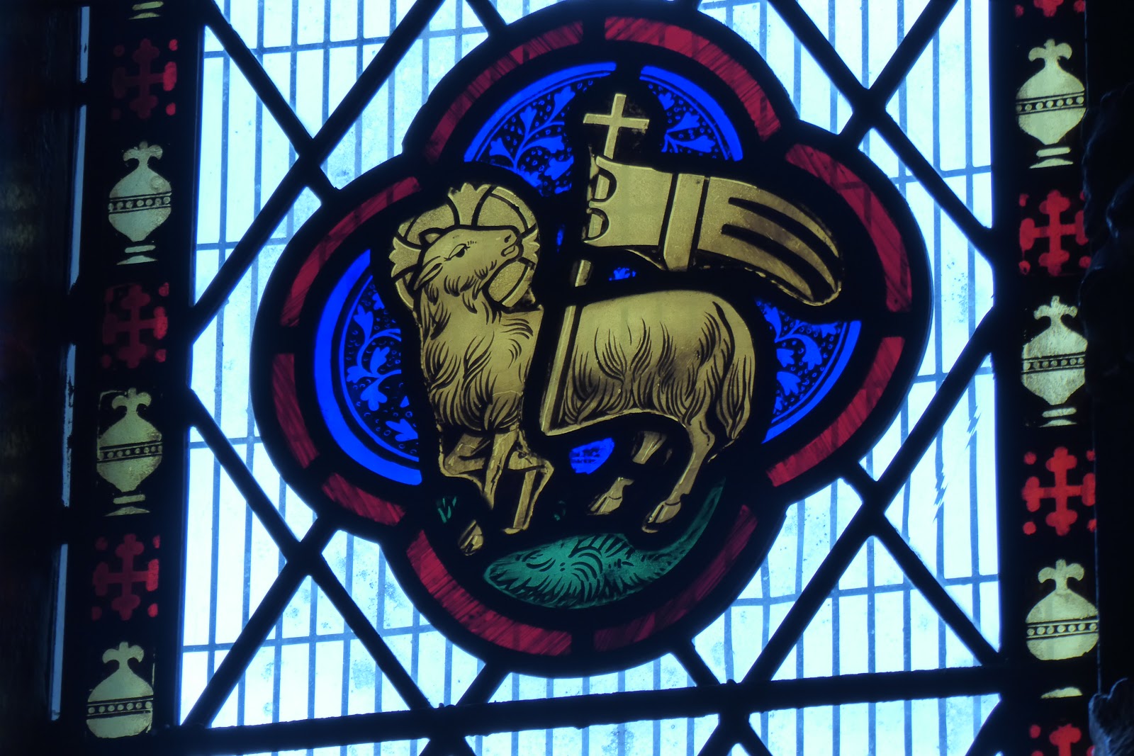
Visually, you are hit as soon as you step inside, in the manner of a Phil Spector wall of sound. The interior is not huge and it is possible to absorb something of a snapshot of the rich, overall composition in your first glance. But the pleasure really comes in walking around the place, or simply re-orientating one's gaze, and in so doing revealing one absorbing detail after another: patterned wall stencilling, gorgeous tiles, cute, bespoke metalwork, and stained glass, which, like almost all the interior decoration, was to Pugin's own design.


John Talbot, the 16th Earl of Shrewsbury, a Catholic magnate and Pugin's main patron, and who had his home a few miles away, financed the entire construction.  The Earl was prepared to spare (nearly) no expense on what Pugin billed as a perfect realisation of a medieval (and hence, in Pugin's mind, Catholic) parish church.  The church was built between 1841 and 1845, at the height of Pugin's short but eventful career (he died at the age of 40 in 1852).  Since it was the least compromised of his projects, Pugin cherished it: "Cheadle, perfect Cheadle, my consolation in all afflictions".
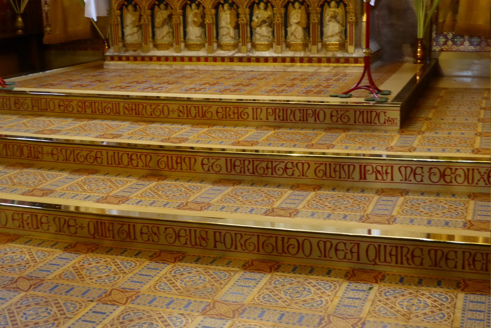
The church is often described as richly or lavishly decorated, but these epithets risk failing to do justice to Pugin's decorative genius, inasmuch as "rich and "lavish" can often simply indicate "filled with swag".  That is, they can all too easily be applied to some ghastly collection of billion bric-a-brac such Versailles or Mar-a-Lago. Cheadle's richness, by contrast, is not about bling: it is not weighed down with alabaster statuary or solid gold fittings (albeit there is some gold leaf about).  In fact, the church's proudest material feature is the use of a special type of ceramic for the floors (encaustic tiles): hardly a glamorous boast (albeit Pugin, with his uncanny, Alan Partridge-like knack for unintentionally absurd turns of phrase, told his client that it would produce the "finest floor in Europe"). The walls patterns are stencilled on. The sumptuous effect comes down to the intricacy of the decoration and the bold, unapologetic use of colour.


The associations conjured by adjectives such as "lavish" are also unfair in that Pugin's decorative scheme has a coherence - and hence a beauty - that always seems to elude oligarchs' palaces and other such repositories of lavishness. Indeed, the coherence here is almost terrifying. Every pattern seems to respond to every other; every spur of the tracery in the carved wood roodscreen has is place in an intelligible geometric scheme; even the candle-holders are, I noticed, cleverly aligned with the stencilling on the walls. This is an interior that produces the visual equivalent of a melody, a choon. It is something that you can hum along to.


Like any good track, it is ultimately built around simple patterns, or hooks.  All the fittings and decorative elements, however intricate they seem at first glance, resolve down to pleasingly legible, even bold, manouevres: compass-and-straight-edge construction in the tracery, geometric patterns in the tiling, red-painted metal fleur-de-lis clasps that join the candle-stick holders to the walls. The richness emerges from the inexhaustible and inventive compounding of the smallest parts, to create larger, coherent elements, which are compounded with others in turn, and so on and on.


This is an essentially fractal approach to design: arrangements that work on multiple scales, that avoid resolving down to monolithic, Platonic geometry.  Fractals get more intricate the closer you look, yet rely upon relatively simple procedures to generate that intricacy.  Indeed, both the rood cross (below) and the stencil design in the chancel (above) are reminiscent, interestingly, of a specific mathematically defined fractal, the "quadratic cross".
Courtesy of FracLab: https://imagej.nih.gov/ij/plugins/fraclac/FLHelp/Images.htm


Another evident feature of Pugin's in-practice design philosophy is that he is big on intelligibility, not just in matters of layout and symbolism but in all decorative and architectonic details. Pugin doesn't ever mumble: he wants to be understood at all times. Take how, for example, with the carved wordwork of the roodscreen, all the main lines of the tracery - all the compass construction lines - are picked out in gold leaf. It is a device that says: "look, see, this is how this has been put together".  I like that.


Intelligibility is not, except intermittently, anything to do with structural or functional honesty - honesty being a quality that only idiots assume to be important in this context - but, rather, about the opposite of meaninglessness, arbitrariness.  There is no sensible reason to think we need or desire honesty - non-deception - in architecture any more than we need or desire non-deception in theatre, literature or music; there are quite a lot of good reasons to think that deception is a perfectly legitimate artistic device. But we do need and desire intelligibility: we do need architectural form - this line, that curve - to make some sense on some level, because making sense is the basic underpinning of aesthetic experience.

Pugin the visual genius understood this implicitly.  But Pugin the writer failed completely to get it. He wrote - implausibly enough for someone resurrecting a historical style using modern, industrial techniques - that what he was doing was building "true" or "real" architecture.  Timothy Brittain-Catlin exposes the silliness, and bullying harmfulness, of this rhetoric in his wonderful book Bleak Houses.  He argues that that Pugin and others at the time were, in condemning non-Gothic architecture as "fake", echoing the language of sectarian Christian polemic: the insistence that this or that faith (Catholic, Baptist, Presbyterian, etc) is the true one, and that others are shams, imposters. Given that Pugin's schtick incorporated a fair amount of sectarian shoutiness (he was a loud and tactlessly proselytising Catholic convert), Brittain-Catlin's thesis seems plausible.  But perhaps a more fundamental, straight-forward explanation for why Pugin, like many other architects, modernists notably, kept resorting to the rhetoric of honesty is, I think, simply that the proposition that "architecture should be true to itself" sounds like, in a somewhat double-sense, what Stephen Colbert would call a "truthy" one. It sounds right, and so people said it, and have carried on saying it. Architects have always been better with visual logic than with propositional logic.

At best the claim of realness was meaningless as applied to Pugin's own work; I think on a fair assessment it was demonstrably false.  His buildings were, in fact, contrivances.  But that is, repeat, not a criticism: so are, surely, all works of art.  The non-necessity of their existing in the first place does not preclude their internal composition being infused with meaning and/or logic. Pugin's buildings might be mad, contrived and obsessive.  But to the eye - and this is the only important thing - every line, every decorative inflection, every wider compositional gambit, makes sense on some, geometric or mimetic (or both), level.


This is why his works are beautiful, which is, in turn, why they dearly loved to this day. Whilst I was working my way around the place, an old man walking by spotted the painter and struck up a conversation with him. It turned out that the elderly gentleman had himself, some time before, re-painted nearly the whole of the interior of the church. It had taken him 20 years, he said (which seems plausible).  The younger man then took some time out to walk around the church with his predecessor, both examining the latter's handiwork and talking about the techniques he had used. A touching moment of generational baton-passing that I felt privileged to witness.

This vignette prompts an observation that further reinforces the conclusion that the power of the work cannot depend on its honesty, reality or truthfulness to itself: nearly the entire surface area of the the interior of the church is new, and inauthentic, in the sense that it is the application of paint by someone working some 150 years after its consecration as opposed to the original material article.   Does this detract in anyway from the effect?  No, of course not.  As with the late construction of Mackintosh's House for An Art Lover, discussed in a previous post, if anything, the magic is enhanced by the knowledge that the design exists as part of a living, renewing structure, rather than as a historical relic.  Authenticity is a hollow virtue.  I'll take colour and life instead any day.

Sunday, 18 September 2016

Helping out at Open House

I've been "doing" the Open House London weekend for several years now.  I've become fairly enthusiastic about it too: each year, I race around a particular borough and catch as many as buildings as I can over the course of the 2 days.  And of course I've previously blogged about what I've seen. This year, I thought it was time to participate a little more actively and volunteer as a steward.

I enjoyed the experience.  When you sign up, you get to select, online, at which building - out of those participating that have requested help - you want to be posted.  I chose a fairly low-key, but seemingly interesting site: a 'House for a Painter', a former photography studio (and before that, Victorian warehouse) in Wandsworth, whose artist owner, Will Monk, wanted to convert into a combined living quarters for his family and studio unit. Architect Dingle Price has pulled this off by, in effect, inserting a modest-yet-fully appointed 2-storey house into one half of the floorplan, leaving a double height studio to occupy the remaining space.

(http://www.themodernhouse.com/sales-list/house-for-a-painter/)
I thought it looked, in the photos, like an attractive, resourceful piece of architecture. The actuality didn't disappoint: it is lovely, bright space.  It is also a house that - surprisingly, given its industrial setting and semi-industrial function - seemed rather more homely in feel than the average private residence that features in the London Open House programme.  This probably is a function of its simple, sturdy, relatively unflashy fittings and furnishings: original pine floors complemented by a staircase and cabinetry constructed from pine planks; white plastered walls.  As I say, this contrasted pleasantly with the typical private house component of the weekend's offerings (some 10-20% I'd say), which can tend towards rather tedious exercises in tastefully expensive granite surface / enormous single-pane window unit / sliding-roof / fancy LED lighting / bang-on-trend slate-grey palette wankery.

Anyway... as for the volunteering experience, my main function as a steward, it was explained, was to cast a watchful eye to make sure no-one was opening cupboards, playing with taps or generally being overly-familiar with the home and the owners' belongings.   In fact, this task was relatively straightforward, since Dingle, the architect, gave all entering visitors a brief spiel explaining the history of the project and setting out the ground rules about not touching things or taking photos.  I only had to intervene twice, I think: once to prevent someone nosying in a wardrobe and the other time to stop a toddler from toppling a crate on which a lamp was resting.  

Other than this, it was just a case of fielding questions from the visitors as best I could (as a volunteer you are issued with a "Can I help?" sticker).  It was interesting to hear what sort of questions people ask.  Mainly basic stuff, which you find you can, surprisingly, answer (not least because it was already covered in the introduction that the architect gives and which you overhear being rehearsed several times thoughout the day).  Eg, What is this place?  Who lives here?  What was the building originally?  Easy-peasy.

Sometimes people ask about the furnishings and fittings, in which case it's more hit and miss.  I should have perhaps thought to ask beforehand about the kitchen worksurface, since there were inevitably a couple of questions about that.  I was happy, though, to be able to identify what the reproduction Gerrit Rietveld Red and Blue Chair in the living room was supposed to be when I was asked about this (all that De Stijl spotting on my trips to the Netherlands has finally paid off).   Other questions, though (including a request to sit in the aforementioned, rather delicate-looking, chair) I had to refer to the owners, who were onsite as well to oversee proceedings.  

There were a couple of other stewards on the afternoon 'shift' with me.  It was interesting to talk to with each other and discuss our respective backgrounds and motivations for volunteering.  One lady was a trained architect, and I think she mentioned, architecture teacher.  I mentioned my writing about the subject and my background in construction law work.  The other person wasn't herself in this line of work, but her daughter was an architect and that had inspired her to take part in the event.

Indeed, not just the volunteers but many of the people who attend Open House buildings as visitors are connected in some way to the industry: at all of the architect-led tours I've been on over the years as part of the weekend, you hear questions from the attendees about aggregate mixes, roof drainage and so on which could only come from QSs, engineers or other people fairly versed in these thing.

But some attendees are simply locals curious to get under the skin of the area where they live.   Such as, apparently, David Harewood, the famous Homeland actor, who dropped by late in the afternoon. One of my fellow stewards had a long chat with him: it turned out they knew each other as their respective children go to the same school, in a neighbouring borough.  It's a small world.  

Saturday, 27 August 2016

House for an Art Lover

Do you ever wonder... When you see something renowned both for its historical importance and its supposed beauty and you experience a sense of awe: just how much of that awe is down to the inherent artistry of what you are looking at and how much is down to, instead, the aura of importance that it has?

Are, for instance, visitors to the Sistine Chapel, swooning at the experience, really reacting to the compositional brilliance of Michelangelo's frescoes, or are they reacting to their fame?  Is the thrill that so many people have at looking up at that fabled ceiling, in truth, the thrill of proximity to something that is unique, of incalculable value and widely recognised as culturally significant, as opposed to a personal, aesthetic response to the actual artistry itself?  Is part of the excitement of seeing the Mona Lisa in the Louvre all about the prior queing to get in, the anticipation, the required jostling of other tourists in the crowded room that houses it to get a decent view of that tiny, roped-off canvass?

It's hard to say, isn't it?  But it is the sort of question that has troubled a lot of people ever since Walter Benjamin's musings on the 'cult value' of art objects - how they can, quite apart from their aesthetic merits, serve as focal points for ritual, spiritual experiences - and how this function is affected by the modern facility of their mass reproduction, in particular the invention of photography (ie his 1936 essay The Work of Art in the Age of Mechanical Reproduction).   

In the 1970s, John Berger, in his influential TV series and accompanying book, Ways of Seeing, took this idea and added a cynical twist that made the question even more pressing.  Berger argued, pretty convincingly, that the immense importance that people - both private collectors and public galleries (and their visitors) - place on the authenticity of oil paintings and other art works can only really be explained, given the ease with which the actual image can be reproduced and disseminated, as a kind of pseudo-spiritual response to the market value of the object itself.

On this view, one is humbled by the work's enormous price tag (or its being 'priceless'). The original painting is (to a greater or lesser extent) not really any more beautiful - certainly no more insightful or interesting - than a copy, but it is more unique, by virtue of being the original, and this uniqueness gives it scarcity (and hence market) value that that the copy lacks.   An art work's cult value, in the end, becomes its market value:
'The bogus religiosity which now surrounds original works of art, and which is ultimately dependent upon their market value, has become the substitute for what paintings lost when the camera made them reproducible.  Its function is nostalgic.  it is the final empty claim for the continuing values of an oligarchic, undemocratic culture.  If the image is no longer unique and exclusive, the art object, the thing, must be made mysteriously so.' (John Berger, Ways of Seeing, BBC/Penguin, 1972, page 23) 
Whoops, society! Oh dear, the art world! What could be more awful, more philistine, than going weak at the knees at the symbolic representation, in effect, of a huge pile of cash?  

But even if you don't want to follow Berger in all his cynicism (and I'm not sure I do: isn't it really the social, cultural importance of the tangible object - its 'ritual value' rather than its monetary value that we are investing with spiritual awe?), I think you have to admit there is at least a tension between appreciation of the iconic status of an art work and appreciation of its inherent qualities. There's nothing wrong with being awed by the cultural significance of the Mona Lisa, or the Seagram Building, say - but it's not quite the same thing as assessing, with one's own eyes, the artistry involved in these things. Importance is not, arguably, quite the same as artistic merit.   

So perhaps the best way of viewing a painting is, actually, at least in the first instance, to look at a print or indeed an image online.  That way, the cult value of the art object is, perhaps, less likely to interfere with your appraisal and appreciation of the painting for its beauty (or otherwise) as a painting.  Such an approach seems less than ideal, though, in the case of architecture: you really want to be able to walk around / inside a building to get the true measure of it.

Suppose, though, you could visit a thoroughgoing, detailed replica of a famously beautiful building. That would make for a nice scientific control, wouldn't it?  If your spine tingled as you walked though it, you would know that the architect - qua designer rather than qua iconic figure - was truly onto something.

This is almost what I was able to do, recently, in Glasgow.  For I visited the House for an Art Lover, a design by Charles Rennie Mackintosh, with interior details supplied by his wife Margaret McDonald, of 1901, constructed between 1989 and 1996, some 60 years' ago after those two famous Glaswegians' respective deaths.  

Strictly speaking, the building is not a replica, not a reconstruction, but an original construction. The designs for the house were produced for a German magazine competition, and although they helped launch Mackintosh's reputation on the continent, they were never built during his lifetime. The modern, 1990s building was the brainchild of a civil engineer, Graham Roxburgh, who managed the improbable feat of convincing the city council to support a scheme to build Mackintosh's house in a municipal park.  A team from the Glasgow School of Art worked to reconstruct the interior from the rather patchy (and sometimes inconsistent) indications given in the drawings Mackintosh supplied to the magazine all those years ago - making educated guesses and sometimes outright inventions (for example, in one particular room there is nothing but the walls in the plan to go on) but always guided by the hints provided by Mackintosh and McDonald's wider ouevre and a careful consideration of the techniques and materials available at the time of the original design.

Well, I can report that, despite that its recency, despite it not being an authentic historical object, the House of an Art Lover is an inspiring place.   It is beautiful, and fascinating, throughout.


In some parts, particularly the ethereal Music Room, it is even spine-tinglingly magical.


If anything, the fact that so much of the detailing is guesswork - if painstakingly careful guesswork - on the part of present-day experts, as opposed to historical artefact, actually contributes to the fascination. Take, for example, the fabric banners that adorn the casing of the windows in the Music Room. All the designer had to go on here was an incidental detail of a perspective drawing of the room by Mackintosh: really no more than a tiny smudge indicating an elongated female form. The information boards explain how the designer experimented with blowing up this smudge to a full scale image, which didn't, in the event, provide a usable guide, before coming with an original interpretation based on a close study of the kind of lines and colours used in other Mackintosh/McDonald designs.


The result is not, therefore, an authentic historical record, but it is no less interesting - no less beautiful - for that.   The team have had to come up with creative interpretations like this throughout the whole house, so scanty is the information provided by the original set of drawings.  I think this approach is quite heroic in its own way: simultaneously brave and scholarly (two adjectives that don't usually sit together in the same sentence).

There are a couple of other advantages, it occurred to me, to experiencing a great, historic design through the medium of an entirely modern construction. One may be that a wider group of people can afford to to do this.  House for an Art Lover has a relatively low admission price: £4.50 (including an audio guide).  Whether this down to a feeling that people will not pay more than this to see something that is not an authentic historic monument, the conservation/upkeep costs being lower than with a semi-decrepit building, or due to cross-subsidy from the weddings and other events regularly hosted there, it is hard to say - but my guess is that a 100 year-old building of this scale and interior richness would have cost more to visit.

The other great advantage is that there are no rope barriers, no signs, even, telling you not to touch the (reproduction) furniture.  Nor are there attendants hovering around the rooms watching you like a hawk.  This gives the visitor a far, far greater sense of freedom than at the average historic attraction. Indeed, this makes the experience actually rather more immersive than is usually the case with this sort of thing: you can even sit down at the piano whose fantastical housing is the focal point of the Music Room and start playing, as one guy did when I was there.


You really do, in other words, feel transported right into the heart of Charles and Margaret's vision. That this vision appears such an affecting one in material reality, even when shorn of the social-psychological charge of historical authenticity, does rather argue for their genius as designers.   

Tuesday, 10 November 2015

Castle saga continues...

The farcical story of the farmer who built his own house over several years without planning permission, in secret, hidden behind a huge stack of hay bales, is evidence, if any were needed, that architectural flair and the most basic command of propositional logic need not go hand in hand.  I visited the site earlier this year to see for myself; as I reported in my earlier post on the subject, I was stunned by how cleverly designed and beautifully crafted the building itself was despite it being largely constructed out of reclaimed materials (including grain silos for the two 'turrets').  It's pastiche, sure, but it's really, really good pastiche: lovely and sweet without being twee, witty and surprising whilst remaining somehow rather elegant and understated.  I was equally stunned, though, by how foolish the owner, Robert Fiddler, had been in his attempts to circumvent the planning process, and in his apparent refusal to accept the inevitable, namely that the building will have to be demolished in line with a court order to that effect.

Mr Fiddler, having (predictably enough) ignored the demolition order, has now been held in contempt of court. He has been told that he will be jailed if he does not comply with the order by 6 June next year.  Sadly, from the BBC report, he has, it seems, right up to the last moment still been playing silly, hopelessly ineffectual games vainly aimed at keeping the building standing: "Mr Fidler has told Mr Justice Dove that he had sold the house at Honeycrock Farm in Salfords to an Indian businessman and that the injunction ordering demolition was invalid."  What did he think the Judge would make of that? That the law would say 'oh well, Mr Fiddler, since you've sold the property, you are completely off the hook'? Honestly!

It is all rather tragic.  If only Mr Fiddler had possessed the slightest understanding of how to work with the grain of bureaucratic authority he would be able to enjoy the fruits of his considerable constructional achievements.  Honeycrock Castle could easily have been showcased on Channel 4's George Clarke's Amazing Spaces or, perhaps, Grand Designs - instead of on Damned Designs: Don't Demolish My Home.

You could, though, equally observe that if only volume developers such as Taylor Wimpey and Barratt Homes, who, unlike Mr Fiddler, are very good indeed at playing the planning system, had even a modicum of that man's talent and flair for design, suburban Britain would not look anywhere near as awful as it does.   Again, legalistic book-smarts and design ability are two very different things, and we live in a world where if you want to build anything you need a lot of former and absolutely none of the later.  

Friday, 16 October 2015

And the winner is...

Last night, the winner of the RIBA Stirling Prize 2015 was announced: Burntwood School in Earlsfield, South London by Allford Hall Monaghan Morris.  


For a contrasting, more positive assessment, though, take a look at Oliver Wainwright's write-up in Guardian

Wainwright makes a persuasive-sounding case for the building, but I stand by my criticisms. People are drooling over the angled concrete pre-cast panels, but only because this 50s/60s retro style is currently bang on trend: indeed, half the other buildings on the shortlist have a similar sort of finish.  The panels are unlikely to provide much lasting visual interest, although, in fairness, the Guardian article does talk about "... the changing light playing across the buildings’ hefty sculpted surfaces" inspiring students' artist endeavours.  Hmm, mayyy-be. But if, instead, the real gravamen of the appeal is (consciously or unconsciously), as I suggest, the present modishness of the retro concrete style, then that really tells against the decision.  It takes a particularly moronic type of philistinism to treat astuteness to trend as the highest possible virtue in art.   Particularly a type of art (architecture) whose physical presence has an unfortunate habit of sticking around for much longer than the trend in question.  But there we. It is the RIBA we are dealing with here, after all.

Maybe it all gets a lot better inside: I didn't get to see the interior when I swung by.  But the pictures do not look that all that compelling.  Indeed, all Wainwright really has to say about the inside is that the classrooms "... enjoy high ceilings and big windows".  Well, the high ceilings are surely a product of the awesomely handsome £41 million budget and the capacious nature of the school's suburban grounds rather than any special genius on the part of the design team.  And the big windows might have something to do with the fact that the extensive grounds means that the main new building is lucky enough not to be immediately overlooked / overlooking other properties: again, not a triumph to the lay at the feet of the architects.  

Contrast the generous parameters of the brief for Burntwood School with that of, say, Clapham Manor Primary School, which was nominated for the Stirling Prize in 2010 but didn't win.  Clapham Manor, which I visited during last year's Open House London, involved a much more challenging brief: the size of the site for the new extension was not much more than a postage stamp.  Yet it converted this into a far, far better-designed building.  That school presents an inciting, welcoming front to the street, with interior packed full of ingenious features, such as easy to open, letter-box-shape windows which somehow give the classrooms, as the review linked above points out, the sensation of nesting in the trees. 

Burntwood, instead, goes in for dull, po-faced seriousness.  Indeed, one of the stated ambitions of the design was to ape the feel of a university campus in the hope that the supposedly more 'grown-up'-virtues of tertiary education will rub off on the pupils by association - a painfully crass gambit for the reasons mentioned in my earlier post. 

What the Burntwood design had going for it was, crudely, a very, very generous budget, as mentioned earlier. And that really is the main point of the RIBA's decision, it seems. For this was one of the last schools to be built under the last Labour government's Building Schools for the Future initiative, which was cancelled under Michael Gove's tenure as Secretary of State for Education.  As Wainwright himself says, the decision to award the Prize to this project "... sends out an important message about the importance of investing in the design of schools". Hear, hear: but is the RIBA really the best, the most-disinterested stakeholder to be delivering that message?  

You see, I'm by inclination a supporter of the Building Schools for the Future programme that the Coalition government scrapped.  Gove's accusation that architects were "creaming off cash" under the scheme sounded, frankly, hysterical.  If this was something that was ever happening, the Government ought to have been able to prevent it through being a canny client and drafting better appointment terms and generally keeping better tabs over procurement processes.  Yet if the RIBA wanted to itself lend substance to suspicions that the programme (or any hoped-for replacement) is viewed by architects as a gravy train, using the Stirling Prize to make a political statement by handing out the award to the mediocre, but very costly Burntwood School is a great way to go about it.  


Sunday, 11 October 2015

Peckham's ugly progeny

Previously, I wrote about Will Alsop's Peckham Library, which I saw as part of this year's London Open House (item '6.' in the post).  I said that I suspected it must have been an influential work, because the building seemed to embody the defining characteristics of a whole era of British architecture (circa 2000-2010) and it dates from early on in that period (2000) and won the Stirling Prize - ie, it would, therefore, have certainly come to the attention of all of the architects of that generation.  The example set by Alsop wasn't a particularly edifying one: as innovative as the Library may have been, it set a dismal trend for half-arsed gestures towards 'friendliness' (outbreaks of curvilinearity, brightly coloured panels and a general lack of gravitas) and a commitment to the sort of fun-less 'fun', in the form of tiresomely wacky spatial organisation and funny-shaped roofs, that, wrapped up in appropriate jargonese about 'place-making' and 'aspiration', one can all too easily imagine receiving a hearty bureaucratic seal of approval.

At any rate, I can't resist posting about something I saw whilst out cycling this weekend which seems to ape the stylings of Peckham Library more literally than I would have imagined anyone would dare, let alone care, to.  Note the light-green (presumably, as with the Library, patinated copper) cladding to pick out a rectilinear board of a first floor facade, the use of pilotis to mark out a forecourt at the front, and a supposedly mischievous element of non-orthogonality in the roof-line.  The building in question is an extension to primary school, St Polycarp's, in Farnham, which, apparently, was designed by an outfit called Re-format and completed in 2012 at a cost of £1 million.  Since only a short while later (in the last couple of years), perhaps in small part due to the devastating criticisms of the likes of Owen Hatherley from 2010 onwards, the whole design philosophy fell dramatically out of favour, this very recent building manages already to look very dated.  As well as shit.  

St Polycarp's RC Primary School, Farnham (2012)

Peckham Library (2012)


Friday, 2 October 2015

Open House London 2015 - Review, Part 2

Continuation of my review of what Southwark LB had to offer in this year's Open House event (see here for Part 1) :-

6.  William Booth College, SE5

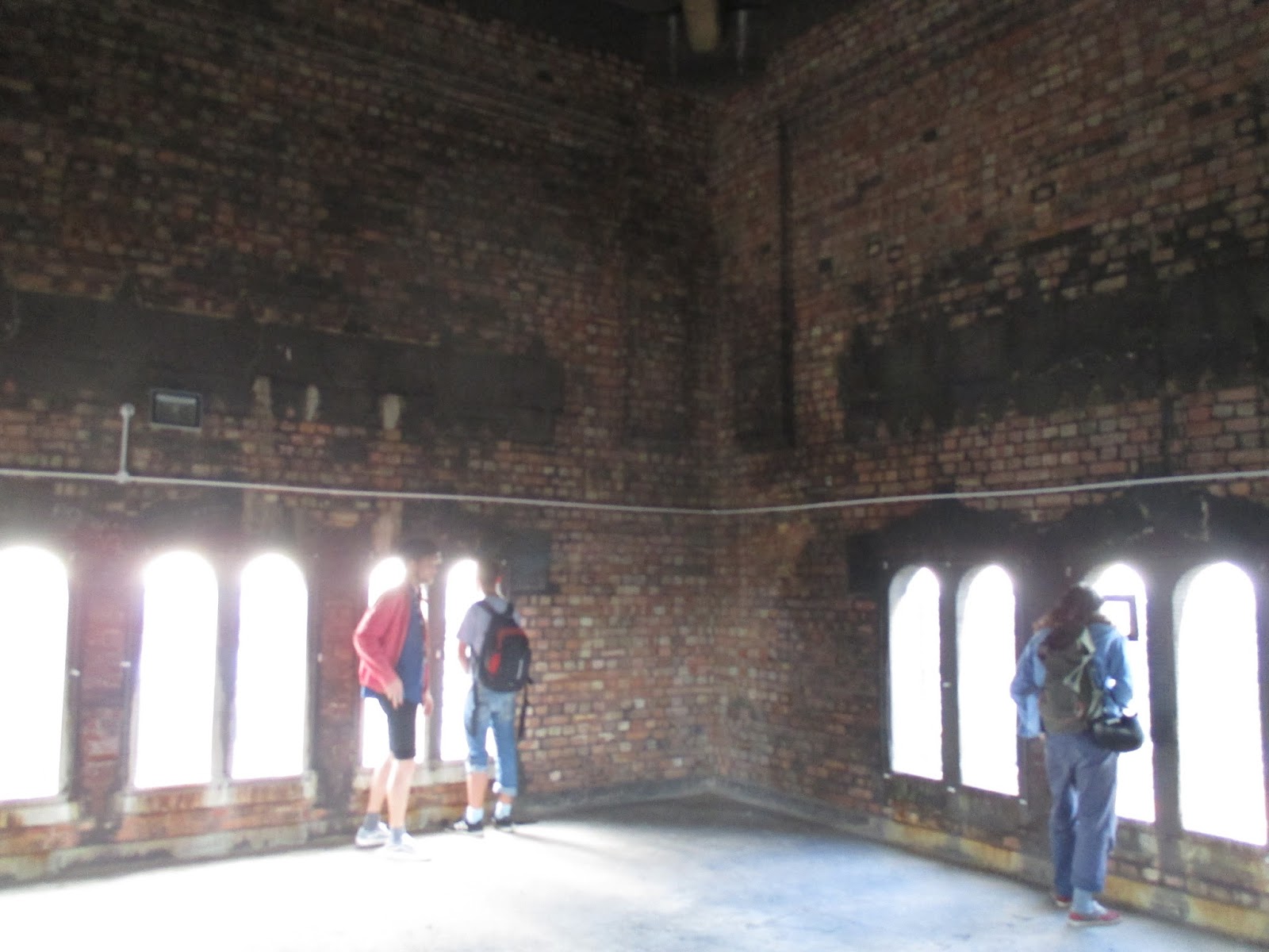
Just over the road from Denmark Hill station, this seriously imposing, deliberately barrack-like set of buildings, designed by Sir Giles Gilbert Scott (Battersea Power Station and the classic red telephone box), serves as the Salvation Army's training school for 'officers' (ie the denomination's version of ministers or clergymen) .  It is not, by some way, the most attractive of Scott's work.  Its tower though - according to the officer who gave us the tour, slightly higher than the dome of St Pauls - offers a great panorama of London and a good vantage point to survey the new face of the City, Shard, Walkie Talkie and all.


7.  ORTUS, Camberwell

This 2013 building by Duggan Morris Architects is bang on trend.  With a vaguely Arne Jacobsen (St Catherine's College, Oxford) feel, it's all tasteful, nicely finished rectilinearity in exposed concrete, brick and glass.  It is, therefore, desperately boring.  

What does the building do, anyway?  Not entirely sure:  it is apparently a "pavilion housing learning and events facilities, cafe and exhibition spaces" according to the Open House guide. The promotional material attempts to elaborate with babble about providing a "totally immersive learning environment" via "interconnecting spaces to encourage intuitive learning activities".  Hmm.  Here's an idea.  How about, folks, when you are writing this sort of thing you try saying something like "Local schools book out rooms in our building to put on lectures or rehearse plays." (if that is indeed the deal - who knows)? Or would that make it all too obvious?  All in all, I didn't find this to be a terribly enlightening or inspiring visit.


8.  Eco-home, Carmarthen Place, SE1

This house, tucked away in a quiet courtyard, was assembled in a matter of days from prefabricated wooden sections, bolted together.  This ought to translate, one would imagine, into an appealingly techtile (my word for 'technologically intelligible', ie that winning sense of 'ooh-you-can-see-how-that-was-put-together') appearance, but somehow neither the interior nor the exterior really draw one's attention to the construction process.  This is despite the minimalist finish: all of the interior walls are just the bare spruce of the prefabricated cassettes and the exterior finish is plain wood as well.  The problem is that if you didn't know about the build method, you would assume that all the wood was mere cladding behind a standard concrete and steel frame or breeze block construction.  

Inevitably the finish, particularly in the interior, is to a high standard, but it's all a little dull frankly.  Here's a big plain wall of spruce; here is another big plain wall of spruce; and here's another big plain wall of spruce, but, look, it's curved this time.  It has much less of the resourceful charm of the other domestic build, Asylum Road, that I saw earlier in the weekend (see Part 1). It's not that Asylum Road is less minimalist in style, or any more filled with stuff: both places are composed of undecorated planes of material.  But Asylum Road's blank planes are so much more engaging because the tighter space-requirements and the architects' sensitive responses to those requirements, mean that the particularities of each pane of glass, each metal frame - their position, their dimensions - appear highly intelligible. There, everything is just right.  Here, all the dimensions - of this or that wall, or banister, or window - whilst unimpeachably sensible, also appear, in their particularities, more or less arbitrary: nothing in their geometry asserts itself as having had to be designed that way.  It's the aesthetic equivalent of the difference between a poised, tender touch and an indifferent shrug


 9. Brunel Museum (Thames Tunnel Shaft), Rotherhithe

The Thames Tunnel, between Rotherhithe on the south side, and Wapping, on the north, of the river, was the first tunnel ever to be constructed beneath a river.  Built by Marc Brunel, assisted by his now more famous son, Isambard Kingdom Brunel, its construction took 18 gruelling years between 1825 and 1843, nearly killing Isambard (and actually killing a number of workers) in one of several catastrophic floods.  Why was it so difficult?  Because the Brunels were basically tunnelling through sand and wet clay: very much like trying to dig a hole in the wet sand on the beach where it meets the sea.  Worse in fact, because they were tunnelling all too near to the bottom of the Thames, hence the frequent flooding. Worse, moreover, because the Thames in those days was a huge foul sewer and hence completely toxic - several of the men working on the tunnel went blind from the 'river gas' vapours alone.  Although the tunnel helped cement the reputations of the Brunels, was hailed as the Eighth Wonder of the World upon its completion and the techniques used in its construction paved the way for all subsequent successful soft-soil tunnelling operations (a mainstay of the London Underground network), somewhat tragically (given all the effort, expense and loss of life and limb) it was never profitable - largely because the finance necessary to enlarge the entrances to allow horse and carriage traffic to enter never materialised. 

So soggy and insubstantial was the material that they were conjuring with that in order to create the shaft at Rotherhithe, rather than digging downwards, Marc Brunel built an enormous brick and steel drum (much like a gasometer) which was allowed to simply sink under its own weight, at a rate of a few inches a day, into the mud.  This shaft was, for Open House, open to the public.  One could descend about two thirds (I believe) of the original depth: the final third of the depth lies beneath a more recently installed floor, which covers the not-entirely-aptly named London 'Overground' tube line (formerly the East London Line and before that the East London Railway), the tube network having taken over the Thames Tunnel in 1865 making it the oldest piece of infrastructure in the London Underground system.  It's a cold and eerie space, rumbling with echoes of the tube trains below.  The place and the story behind it serves as a reminder of the majesty but also something of the terror of great 19th century engineering projects.  


10. The Old Mortuary, Rotherhithe

Round the corner from the Brunel Museum is a community centre located in a late C19th mortuary.  According to the lady giving the tour, Rotherhithe needed a mortuary because it was a major receiving point for corpses found washed up beside The Thames at that time, thanks in part to its policy of rewarding those who retrieved bodies from the river with the payment of a crown a corpse (Wapping paid only half a crown).  

The building has been modified a fair bit since, but there were at least a few grim details to see, such as a big iron bar crossing the ceiling of one of the rooms used to hang bloated bodies up to drip-dry - or the fact that the community centre's kitchen was formerly a room into which putative kin of the deceased were led to identify the corpse, which they did through a opening giving onto the next room where the corpses were laid out (now the main events hall). It was somehow gratifying to stand in the latter room and be served tea through the same opening.  


11. Sands Films, Rotherhithe

I almost didn't bother seeing  this one as the write-up in the guide didn't appear all that thrilling ("Grade II listed riparian granary built with reclaimed timbers felled in 1700s. Converted in 1970s to picture library, film studios, prop and costume workshops ... "), plus the day was coming to an end and I assumed that the place would be closing soon. However, it turned out to be the most magical of all the places I visited during the weekend. 

I hadn't heard of Sands Films before, but it transpires that they are thriving production company.  They make sets, rent out studio space, but are above all known for making costumes for period dramas, eg the 2005 Pride and Prejudice, The Young Victoria and Wolf Hall.  

The tour we were given was a fairly epic affair, incorporating a proper, 20 minute sit down lecture in the on-site cinema by Olivier Stockman, the company's Managing Director followed by talks by three other members of staff, at different locations around the complex. These included a seemingly impromtu mini-tour by Christine Edzard, a co-founder of the venture and an Oscar-nominated director in her own right.  The best of the four speakers, in fact, was the last, the head of the costume department.  Despite clothes being something I have zero interest in, she had me and the rest audience absolutely spell-bound (funny how you can sense this through the polite silence long before the applause) with a spiel that beautifully explained various aspects of the process of designing and putting together a costume, somehow managed to make telling points about the socio-political implications of the subtleties of Victorian dress conventions, whilst weaving in lovely nuggets about the wider film production (such as the fact that these days casting decisions are often made last minute - causing predictable headache to the costume-makers).  She also managed to take our half-baked questions and spin out insightful, witty, richly (but wisely) opinionated answers. Although it was getting quite late, and many people there hadn't, I would guess, counted on the tour lasting as long as it did, she received the closest thing you can get to a standing ovation from people already standing.    

The interior itself was rather delightful as well  One imagines a studio as a featureless, strip-lighted hanger but Sands Films's premises is more like a Dickensian warren of low-ceiling rooms.  One room will be kitted out with comfy furniture, antique knick-knacks, books and memorabilia, the next filled with sewing machines, ribbons and jars of neatly-labelled buttons, pins and beads.  There seemed to be a whole floor of stored/used dresses, the racks delightfully by period (eg 1830s-40s).  Ironically, the haphazard warren-of-rooms layout isn't, it seems, an original feature: according to Stockman, the original Georgian warehouse building was simply a brick shell for goods to be piled up in, with no floor even, let alone subdividing walls or floors, indeed, something rather closer to the studio 'hangar' of popular imagination.  


For a long time Sands Films rented the rambling site, but soaring rents prompted them to fund-raise to buy the freehold in 2012.  Lucky they acted when they did, because property prices in London have sky-rocketed since then, presumably meaning that they would otherwise have been forced to move to some anonymous building out in the suburbs by now.