Wednesday, 30 September 2015

Open House London 2015 - Review, Part 1

For this year's Open House London, I decided to take on the London Borough of Southwark. This strip of the capital stretches from a slice of the south bank of the Thames centred around London Bridge straight down to Peckham/Dulwich in the heart of South London. It takes in quite a few big-name sights, particularly around the Thames, including the The Globe, London City Hall and The Shard.  

I focused instead, though, on some of the less well-known locations listed in the guide, visiting 11 of them by the end of the weekend (get that you people who won the ballot to see 10 Downing St or the BT Tower and didn't bother to see anything else!  Not that it's a competition...).  Indeed, so ruthless was I in my quest for efficiency that I walked straight past a couple of places on my list because the queues were too long, resisting the temptation to flash the "L" loser sign at the all-too-patient punters as I walked by.  Anyway... here's a run-down of what I did see.  

0.  A pre-Open House stroll wall around Southwark proper

This part of London, on the other side of the river from the City, is changing all the time these days - with the addition of City Hall a few years back, then The Shard and, recently, the neo-Bankside development visited in a previous post.  What public space remains is filled, it seems, with people doing nothing but taking photographs of the latest architecture (The Shard, in particular), so for 10 minutes or so, before the first building tour started, I thought I would briefly join their ranks.


1. Unicorn Theatre, Tooley Street

Britain's only dedicated children's theatre, which opened in 2005.  The exterior building is a dull box but inside there is lots going on from a design point of view.  A member of the design team giving a tour of the place outlined the challenges of, amongst other things, accommodating fly lofts for the theatre scenery, deciding whether or not to have ticketed seating and the knock-on effects on the interior layout of this, and housing the theatre rabbit on the roof. 


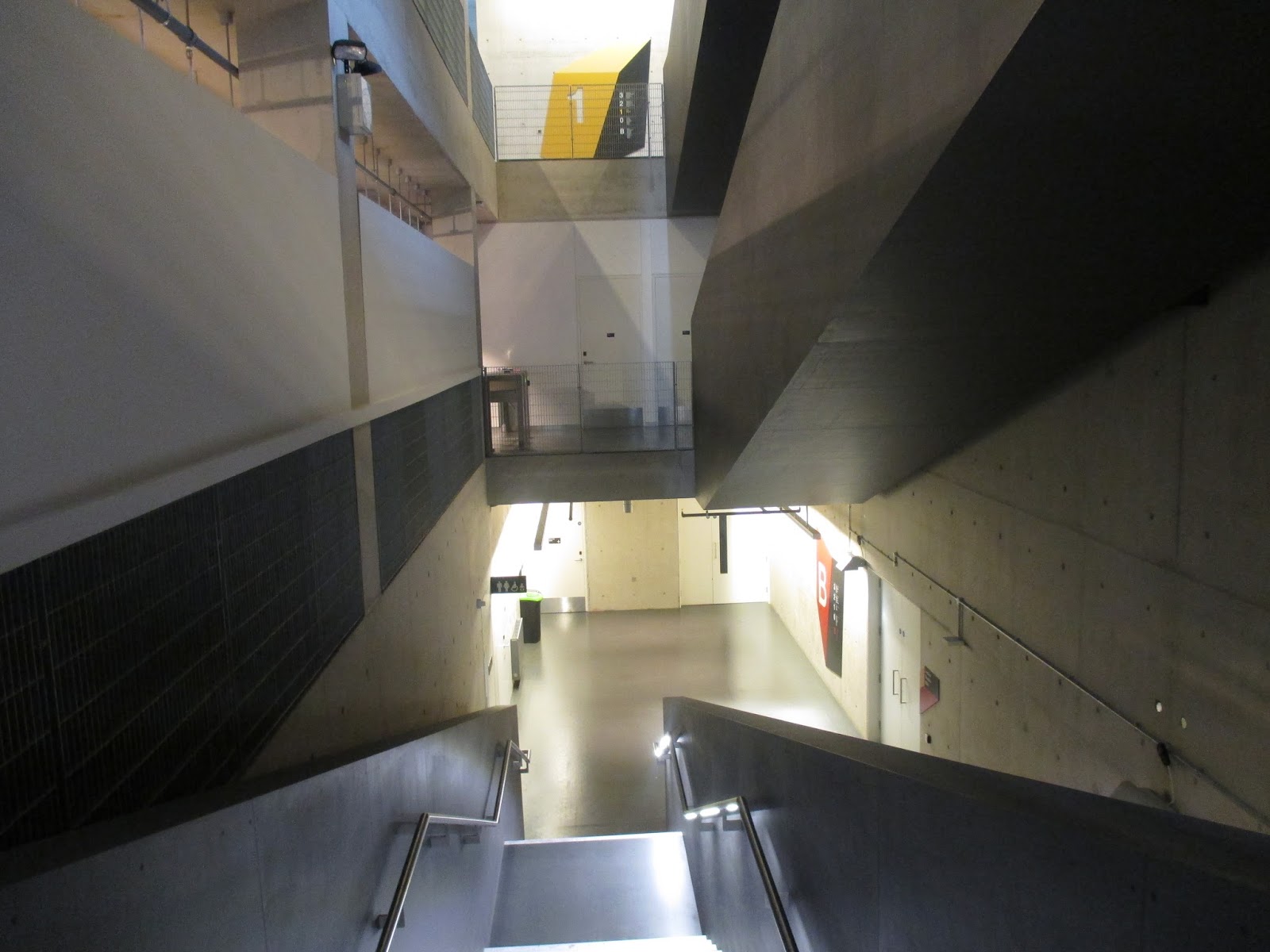
 2. Tower Bridge Magistrates Court, Tooley Street

Just up the road from the Unicorn was another, strange addition to the Open House roster: a disused Magistrates Court, bought up by developers with an as-yet unrealised ambition to turn it into hotel.   The developers signed up to Open House, it would seem, to try to drum up support for the scheme.  They were, rather hopefully, handing out postcards to people so they could make representations in the developer's favour to the local council, the claim being that the plans would be better from a conservation perspective than the likely alternative, namely total redevelopment of the site to make way for residential flats, because the hotel concept would at least retain (some of) the original fittings and fixtures. There are plans, in particular, to turn the main courtroom into a restaurant hall, with the benches serving as dining booths.   

The real appeal here was in marvelling at the bizarre, Marie Celeste way in which the place had been left, apparently in something of a hurry, by the previous occupants: virtually all the fittings in place, down to the coat of arms hanging on the wall the courtroom and the final rota displaying the names of the police custody team on a whiteboard outside the grim holding cells (which sadly there are no plans to retain).  


 3. The Coal Line, Peckham

This event involved a piece of infrastructure that has, yet, no physical presence, not even a construction site.  The Coal Line is a nascent project to create a linear park, just under 1km long, alongside the railway line between Peckham Rye and Queens Road Peckham.  We were taken on a tour of the proposed route of the park by the local volunteer group who are trying to push the scheme through. Or, at least, we walked alongside it, as much of the park is intended to be carried by a railway viaduct traversing abandoned Edwardian coal-delivery sidings, presently off-limits to the public.

I'm, for one, sold on the idea: I think it's great.  In a previous post, I excoriated another proposed linear park - the godawful Garden Bridge across the Thames.  The Peckham project is absolutely everything that The Garden Bridge (TGB) is not.  It involves the reclamation of open space not current accessible to the public as opposed to, as with TGB, the private enclosure of something (ie The Thames) which is already public space; it makes maximum use of existing physical infrastructure as opposed to requiring, as does TGB, a vast and needless lump of engineering to be constructed from scratch at great financial and environmental cost; it will actually function as a genuine public territory - a normal park that you can fucking well walk straight into, for God's sake - rather than, as with TGB, a space where ordinary people are made to feel that they are, at best, being tolerated 'on sufferance' due to the ticket barriers, bouncers and random closures for corporate events; it also brings much needed recreational space to a very densely populated area that doesn't have much of the commodity as opposed to creating, as the TGB, a park that is no-where near anyone actually lives and so by definition can only function as a tourist attraction.  And whereas TGB is a vanity project of Joanna Lumley heading up a cabal of powerful, well-connected big-wigs (this comment is not mere conspiracy theory), Peckham's Coal Line is about as grassroots as you can get, driven as it is by a group of "committed local residents with big dreams and bright ideas", as the website puts it.


The current state of play is that the project organisers are seeking to crowd-fund a feasibility study, something which Network Rail, who own most of the land, have required to go forward with the project.  Even though I'm not a local resident, I've pitched in because this is exactly the way I think future development in this country should happen. I really hope it gets off the ground.  

5.  Private residence, Asylum Road

One of the ideas in the book I'm writing at the moment is the notion that the manoeuvres that people are forced to employ to overcome tricky, restrictive design briefs always tend to add intelligibility to a design, making it more interesting and inviting than it would otherwise be had the brief been less restrictive in the first place.  This principle certainly holds true with this tiny house, built on the footprint of a former garage.  It is completely delightful, and what makes it so are the clever devices that it deploys to maximise the use of space: sliding doors, cub-hole style bedrooms, tiny, sunlit courtyards, use of mixed-height ceilings to make living spaces seem far, far, more expansive than their really are.  There is more going on here than in many a home four or five times the size, but it magically didn't feel cramped - even though there were more than a dozen visitors wandering around inside. Inspiring stuff.


It could have been very different in fact: I asked the lady who, together with her husband designed and built the place, why it was so much less high than the terrace houses that it abutted.  She explained that they had bought the site with planning consent in place, and simply redesigned the house within the existing envelope of the permission that had been granted.  They could have sought to extend it, she admitted, and indeed there was a chance that this would have been granted.  But I don't think they should be regretful about this decision at all: again, arguably, its the very limited envelope in which they were operating which brought the best out of the designers and makes the house what it is.  

6. Peckham Library, Peckham Hill St

Will Alsop's Peckham Library, winner of the Stirling Prize in 2000, is, it dawned on me walking around it, a heck of an influential building.  It basically defines an entire era of British architecture, namely that of the Blair/Brown years (1997-2010), or, more particularly, of the design quango, CABE (Commission for Architecture and the Built Environment, 1999-2011) that they set up and whose recommendations helped promulgate the style-book of the epoch. What does the style involve?  A kind of cheery, irritating vacuousness, basically: bright colours, supposedly 'friendly' curves, wacky spatial organisation and a post-modern obsession with creating 'iconic' forms (read: memorably weird, unique shapes). The classic text (already) is Owen Hatherley's A Guide to the New Ruins of Great Britain (2010), which chronicles how increasingly dismal architecture of this type mushroomed up all over the island over this period.  (The style has, incidentally, now entirely fallen entirely out of fashion: virtually all new developments seem to be exercises in tasteful, grey, largely rectilinear minimalism  - see the entrants for this years Stirling Prize for a flavour).  

I kept thinking, as we toured the interior by a member of the library staff, of Hatherley's book even though it doesn't cover this particular building.  All the basic elements he identifies are here.  The basic design is wilfully counter-intuitive: a giant up-side down 'L' that suspends the main library area above an enormous forecourt.  The building is clad on one side with a material (patinated copper) that proudly announces 'design quality' on the other with brightly coloured panels.  Best of all, the wonderfully crass concept of the "pod" pervades everything.  The pods are strangely shaped enclosures suspended like enormous fruit within the envelope of the building (and in one case poking out of it, to create a typically CABE-) designed to create segregated, quiet spaces within the interior: a comically over-engineered solution to a problem already solved several millenia ago with the invention of the "room". 


It can be argued, nonetheless, as the librarian taking us around did, that, in the context of this particular building, all this silliness was for a good cause: our guide pointed out, approvingly, that the non-intimidating look of the place was intended to be welcoming to kids from what is a fairly deprived area who might be put off attending a library with a more forbidding, institutional feel.  I can believe this: the very young children in particular seem totally relaxed in the place - wandering in and out of the rooms/pods, chatting (quietly and sweetly) to the library staff and members of our tour group.  And it's not a bad building, overall.  Even the pods are, if somewhat useless, well-made and quite attractive as decorative features.  But like so many pioneering buildings, it set a terrible precedent. The desire for a childish 'non-intimidating look' has no sensible application to a residential block of flats - the very idea comes across as insultingly patronising in such a context - and yet, following the feted example of Peckham Library, every developer in the noughties stuck a "wavy roof" (per Hatherley) ontop of each of their jerry-built tower and a random coloured panels on the outside walls.  Alsop, therefore, has a lot to answer for in my opinion.


... To read part 2, click here.

Wednesday, 16 September 2015

Open House London 2015 - Preview

With over 700 buildings opening up to the public, this weekend's Open House London provides another chance to venture into the usually off-limits parts of some the capital's most intriguing buildings.  

The event, now in its 23rd year, regularly attracts hundreds of thousands of visitors.  It is possible to gain access to everything from the grandeur of the Foreign Office building in Whitehall and the skyscrapers in the City of London through to, out in the boroughs, humbler-in-scale, but often equally inspiring, eco-homes, pumping stations, offices and the like.  

Getting the most out of the weekend

With so much to see – all free of charge – it can be hard to know where to start.  Here, then, are some tips on how to enjoy to the fullest what the weekend has to offer.  

Plan your campaign.  Check out the official listings on the Open House website.  This gives details of all the participating sites (you can, alternatively, purchase the mobile app or a printed programme), including vital information such as when each building is open, whether advance booking is required (it is in only around 10% of cases) and whether any talks or guided tours are being given.  Tours by the architect who designed the place are obviously worth catching, but so are those given by clients and end-users: it is always interesting to hear from, say, a teacher about the challenges of staff and childern living through the construction of shiny new extension on a cramped school site and what, in practice, works well about the design, and (if they are candid) what works less well. 

Take on a single borough.  Most buildings are open for a fairly narrow time-slot, say two or three hours, generally, from experience, clustered around the period 10am to 4pm.  If you are visiting several places, therefore, you don't really want to be spending precious hours criss-crossing the city. A good strategy, then, is to focus on a single geographic area: not only does this minimise travel time, but it makes the job of deciding what to see less daunting.  Handily, the listings on the Open House website can be filtered by borough.  There is definitely (I find, at least) a degree of nerdy-pleasure to be had in plotting out a route that takes in the most places in the least travelling distance. It's worth thinking about bringing your bike: cycling can be a satisfyingly speedy way of getting from location to the next, particularly if you pick a borough outside of Central London where the traffic is less heavy.

Say hi to your fellow Open House-ers.  You can generally spot other people enjoying the event marching down the streets clutching their programmes emblazoned with the green Open House logo. They can be a great source of information about what's worth seeing, last minute changes to the programme and how to actually get to the place that you've been walking up and down the same street for the last 15 minutes to find...

Don't leave your critical faculties at home.  Don't feel you are under some sort of obligation to walk around all of the buildings in a state of rapt wonder: something that organisers of Open House stress is that a key goal is to empower us members of the public to make our own judgements about design through “direct experience”, so that we can all contribute to the debate.  As the organisation's website puts it, in an apparent (and welcome) side-swipe at the glossy consultation document, that default mode of public 'engagement' in the development process: “You can't make an informed decision merely through abstract images, such as photos and illustrations. You need to be engaged with the space in question to know what the reality is.”  Obviously, avoid being hostile or rude to those who are volunteering access to their buildings and their own time for the event, but feel free to ask probing questions about energy-efficiency or the reactions of neighbours to the development!

What to see 

Four less-well known, but fascinating places to visit:

Darbishire Place, Whitechapel, E3.  A rare example of an attractively-designed, elegant social housing block, shortlisted for and very much in the running to win this year's RIBA Stirling Prize.


Kingsley Hall, Bromley-by-Bow, E3.  An East End community hall with a lively history.  It paid host to Mahatma Gandhi during his visit to the country in 1931, and the room he stayed in has been preserved as a secular shrine, complete with spinning kit.  Later, in the 1960s, the building housed people suffering from psychosis under the controversial aegis of RD Laing, champion of the anti-psychiatry movement.  

Pullman Court, Streatham Hill, SW2.  Dating from the 1930s and designed by Fredrick Gibberd (the master-architect of Harlow), this is one of the earliest modernist apartment developments in Britain: a set of gleaming white blocks with sleek, cantilevered balconies and elegant metal railings. 

St Botolph Building, Aldgate, EC3.  Less high-profile than other, taller, buildings that have shot up in the capital's financial central in recent years, this Grimshaw-designed office is still an impressive edifice, and filled with uber-cool High Tech fittings and gadgetry inside.

Saturday, 15 August 2015

Stirling Prize 2015: the contenders

The winner of this year's Stirling Prize will be revealed by the Royal Institute of British Architects on 15 October.  Four of the six shortlisted buildings are in London so I thought I'd take a look at them. There's no information on the RIBA website about visiting the buildings, not even proper addresses (so much for public engagement in the process). So I wasn't sure how much access to any of the sites there would be, or even whether I would find them.  

But in the event I got around to see all four in a single day.  I managed to get a reasonably good look as well, including a poke around the interior in two cases.  

So here's my take on (2/3rds of) the shortlist.

1) NEO Bankside
Roger, Stirk, Harbour & Partners

Sumner St / Holland St, SE1


NEO Bankside is High Tech, or structural expressionism, on a domestic scale.  A cluster of medium rise (12-24 storeys) apartment blocks behind the Tate Modern and the South Bank, it forms a joyous assembly of exposed structural members, exaggerated joints and detached lift towers.  I really like it. 

Richard Rogers and Graham Stirk (the project architect here) have, of course, for decades been leading proponents of the High Tech style (Lloyds Building, Strasbourg's European Court of Human Rights etc, etc).  That's because they get it.  They understand what makes it work psychologically. High Tech isn't, as is sometimes claimed, anything to do with functionalism or structural "honesty". No buildings constructed this way are sensible or truly rational in their design.   But they are functionally/structurally intelligible.  The eye delights in reconstructing how they are put together. The particularities of their form, accordingly, make sense.  They are technologically tactile - techtile if you will:  they have this in common with steam engines, LP-record players and (perhaps counterintuitively) the best aspects of vernacular architecture (clapboarding, wrought iron strap-hinges, thatch roofs and so on). You almost want to dig out your meccano set and start adding bits on. The engineering is playful, dramatised, but somehow remains entirely intuitive.  Indeed, it is the only form of modernism that is truly visually nourishing: more articulation of form than bland International Style purism, more intelligible than the tedious arbitrary distortions of deconstructivism. Done with the skill of this practice, it is fun, likeable architecture.  The RIBA citation describes the design as "... almost cute", which I agree with, and agree is no bad thing at all.


The arrangement and sizing of the buildings is also handled well.  By contrast to, say, Central St Giles, by Richard Rogers's former colleague Renzo Piano, the site doesn't feel oppressively overdeveloped. 

This leads on to the handling of the public space.  I'm in two minds about how this has been done. The garden at the centre of the site, between the towers, is green and pleasant enough to detain, but there is nowhere to sit down.   Still, this amount of greenery on a central London site is a rare and welcome thing. In that context, Oliver Wainwright's description of this as a "bleak sliver of manicured garden" in the Guardian write-up of the shortlist is a wee bit unfair.


But I'm not sure about the semi-private, semi-public nature of the space...


In some ways, allowing the public in during the day and locking them out at night could be argued to be a rational time-share division of land.  Apartment-dwellers would legitimately want some privacy and quiet (the garden/thoroughfare is right below their windows), particularly at night. And there is a massive need for more greenery and public space in central London.  Isn't this a reasonable compromise?  Perhaps.  But I'm not sure it works as a matter of human psychology. Feelings about territory aren't really time-limited in that way.  If I regularly used the gated thoroughfare to get between the two sides of the site, I think I'd always feel a pang of resentment that my right to do so was being controlled in this way; I'd feel I was there on sufferance, which simply isn't a nice feeling. And I wonder if the residents, for their part, feel quiet resentment at the invasion of what feels 'their' space by the public during the day.  The RIBA citation talks about an "intricate weaving of public and private space".  Perhaps it's rather too intricate for its own good.

But where the project really falls - crashing - down is it social responsibility.  The RIBA citation gamely reports that the "architects designed for the social housing to be onsite but with the agreement of Southwark it has been redistributed around the borough and almost all of it has so far been delivered".  Which is an ineptly euphemistic way of saying that the developers got away with social cleansing.  This despite Richard Rogers being a some-time urbanism guru who used to write reports urging for "socially mixed" developments. Whaaaat? Oliver Wainwright, in the Guardian piece, explains:

"While the borough’s policy requires 40% affordable housing, the developer, Native Land, agreed to provide just 27.5%, with all social-rented units built off-site in a cheaper area (which have yet to all be built). It justified this in its viability assessment (PDF) on the basis that average sales values would only be £754/sqft. In reality, the flats sold for an average of £1,326/sqft"

That is a tale so woeful that this project surely can't merit the prize, whatever its architectural merit.  

2) University of Greenwich, Stockwell Street Building
Heneghan Peng Architects

10 Stockwell Street, SE10


This building exudes good taste.  It doesn't exude very much else.  The RIBA citation claims it to be a "startling building to put in Greenwich", with all the surrounding heritage.  I wasn't unduly startled.

Smooth stone (as here), or else concrete, cladding brought off to a slightly angled inflection - an inflection vaguely suggestive of a revival of the swinging '60s look typified by the works of Colonel Seifert (he of Centrepoint and NatWest Tower fame) - is very 'in' at the moment.  Pinecladding, 'barcode' fenestration, etc - the style that Tim Waterman brilliantly labelled 'blang' (ie bling meets bland) - are so last decade now.  It is true that politeness, respecting the building line and the deployment of careful (and conspicuously expensive) detailing are still the order of the day, but the cool kids on the architecture block are no longer executing this programme with a vocabulary of form borrowed from Scandinavian saunas but rather one derived from bold and bolshie post-war office blocks. The result is that the style of the day is a curious hybrid of brutalism and bland: blandalism, perhaps?

There are one or two nice features here, mind.  The swept-back angling of the window reveals on the railway-track facing side cleverly does several things at once: providing additional privacy to those working and studying inside; maximising the amount of the attractive stone cladding on display; and adding some articulation to what would be an otherwise rather dominating, regular facade.  


It's also nice to see climbers being trained up the side walls, and some planting on the roof. Not reinventing the wheel or challenging anyone's notions about what a building is or anything, but just nice.  


Nonetheless, it is hard to understand why this up for the UK's top architecture prize. Perhaps it has something to do with the RIBA wanting to make a point about how contemporary architecture can hold its own in such a prestigious, heritage-packed location (that is, amongst the beautiful Georgian terraces of Greenwich and a short stroll from Greenwich Park and the Royal Observatory).  The shortlist citation certainly suggests so, inasmuch as it makes much of the location.  Perhaps, as well, the function of the building is close to the heart of the judging panel, for it houses, amongst other things, the university's architecture department.

I did actually manage to take a look inside.  Strolling past the reception desk into the innards of the university building did, initially prompt me to think, per Mark from Peep Show "Shit! ... I'm not licensed to be in this far!".  At any rate, I had a nose around some empty exhibition spaces and took the opportunity to use a drinking fountain in the basement (and felt quite wily at this). But it later transpired that there are internal, key-card operated gates to main teaching areas upstairs. What's unclear is whether members of the public are actually welcome or not to wander about in the fairly expansive area of the interior accessible without a key-card.  Perhaps this is another example of the confusingly "intricate weaving of public and private space" that seems to be the flavour of the month.

The RIBA citation has it that "[a]ll the interiors exude quality".  (Who, by the way, is writing this stuff?  Someone with all the literary skill of a fucking estate agent apparently.)  At any rate, yes, the interior finishes are smart and well-made.  But they are hardly uplifting or inspiring.  


3) Darbishire Place, Peabody Housing
Niall Mclaughlin Architects

John Fisher Street, Whitechapel, E1


The text of the RIBA citation for this social housing block is priceless.  It describes the stairway thus: "... what a stair: residents must feel a million dollars, like stars on an ocean liner, all graceful curves, an elegant swooping hand-rail and all that top-light."

Again, the "... residents must feel a million dollars, like stars on an ocean liner...". Honestly, if you were penning a novel that included a character who is a dim-witted philanthropist with a penchant for crassly talking down to the poor, you wouldn't dare have them say these words. It would be too unbelievable. Nobody is quite that patronising, quite that lacking in self-awareness, surely?

A further oddity of the award website treatment, and another reason why I was not expecting too much, is that, unless I'm mistaken, it uses the architect's renders (ie pre-construction mock-up pictures) rather than photos of the completed building.  These pictures, are, in any event less attractive than the building in real life, which is a turnabout from the usual course of things.  

It's an elegant building. The mottled brickwork works well. It doesn't attempt to ape the surrounding yellow brick early 20th century architecture, but it doesn't jar with it either. The softness of the bricks also provides a pleasing contrast to the sharp lines of the pre-cast window reveals. Sure, such lines are perhaps another instance of the trend for vaguely '60s stylings, but they're done in a modest, understated way here that should outlast the mode-ishness of the approach. And the finish looks to be of a very good quality.

The tapering of the building on one side is creates a bold effect, and opens up the square beyond as you approach from the south along the road. Again there is a nice, subtle stimulating contrast between the ordered formality of the fenestration and the (slightly) expressionistic nature of the plan. I like the way, as well, that the angled plan is reflected and emphasised in the paving/planting, with its banding that proudly clarifies that, no, the building is not parallel to its neighbour on that side. A less confident architect would have specified gravel or wall-to-wall tarmac, thus eviscerating this aspect of the design at ground level.  

Of course, having laughed at the description of the staircase, I couldn't not take a peek inside. I had to wait a while for someone to come into the building so I could, cheekily, ask to be let in, but it was worth it. Don't be put off by the hype is the moral. The staircase is, in fact, as wonderful as the writer of the blurb was, however ineptly, trying to communicate.


I can't remember that last time I've see such a successful effort at simple beauty, or one so moving, in an apartment building of any kind, private or social.  I don't know if I felt like a million dollars walking up it, but I'll admit that probably has swung me into thinking that, of the four buildings I saw, this would be a deserving winner.  It raises the bar for buildings of its kind, and that is surely what the Stirling Prize should be about.

4) Burntwood School
Allford Hall Monaghan Morris

Burntwood Lane, SW17


It has been said that the experience of eating at McDonalds is like masturbating to pornography: great in the moment, but leaves you feeling dirty and empty afterwards. That is pretty much how I feel about these buildings. My first reaction was 'ooh, that's quite an flash-looking design'. And then that gave way to a sense of emptiness and resentment. There is just so little going on here. Yet again, we're back to the Seifert-aping retro trendiness with the 'cheekily'-angled concrete panelling. Once you get over that... well, that's it really. It's all surface, all cheap-thrills kitschiness. Aren't we supposed to be teaching youngsters the value of delayed gratification?


There's none of the actual fun of the Rogers, Stirk and Harbour development, nor the lasting beauty of the Peabody block.  It's just coldly cool.

The best that the RIBA citation can say about it is that it has the "sense of this being more like a university than a school", something which "... would appear to encourage behaviour to suit". That amounts to breathtakingly fatuous empiricism and equally fatuous reasoning. The judging panel have walked into a school and decided that because the kids were polite to them above average behaviour standards must prevail. They've then deduced that this is down to the school buildings as opposed to any other factor. I mean, really, why do we bother with OFSTED and standardised testing when we have the RIBA? It's also a rather bizarre comment in that the wheeze of schools that ape universities is an old, tired one now - it seems to have been the whole premise of the much-derided "Academy-status" system. Moreover, I simply don't understand how the comment relates to this design; the citation offers: "... perhaps it’s all the pale, finely-detailed concrete, perhaps it’s the elegant covered walkway that links the principal buildings, drawing together the disparate styles and ages of the architecture". None of that sounds particularly characteristic of the architecture of tertiary rather secondary education. Finally, even were there any advantage to a school buying into the associations of university architecture, it's hardly a replicable solution. If every school did it, the alleged architectural conventions in question would lose all association with universities. Which is essentially, in a nutshell, why thinking about architecture in such crudely associational terms is stupid.

Verdict

I'd stress again that my visit and the write-up here covers only four of the six shortlisted buildings. Details of the other two - a cancer care centre in Aidrie, Lanarkshire, and an extension to The Whitworth Gallery in Manchester - can be viewed on the RIBA webpage (ie the one that I have so much derided in this post).  

Of the entries in London, for me, the only contenders are Neo Bankside (the High Tech apartments by Rogers, Stirk and Harbour) and Darbishire Place (the Peabody Housing block by Niall McLaughlin Architects). Ultimately, Neo Bankside should be ruled out because of the appalling approach to the provision of social housing that the history of its development embodies.  This means Darbishire Place, the social housing with the lovely (or "million dollar") stairway is the one that most deserves to win the coveted award.